Modern Controls in Power Apps

Controls are the basic building blocks of canvas applications in Power Apps, providing the fundamental features, functionality, and interactivity.
Modern controls are a new collection of user interface elements in Power Apps whose design is based on Microsoft’s Fluent 2 design system. They help you create modern, more interactive applications. In this article, I will take you through these new controls in Power Apps and show how to use them to build a modern canvas application.
Benefits of Using Modern Controls
Among the benefits of using modern controls are the following:
- Improved user experience
- Enhanced accessibility
- Improved functionality
- Enhanced performance
There are two ways to access modern controls in Power Apps:
- Change the version of your authoring canvas to the latest version that has the modern controls enabled.
- If you are using an older version of the authoring canvas, turn on the new feature under Upcoming features.
For option one, from Settings in Canvas App Studio, select Support, and then edit the authoring version to the latest or recommended version, as shown in Figure 1. This version comes with modern controls enabled.

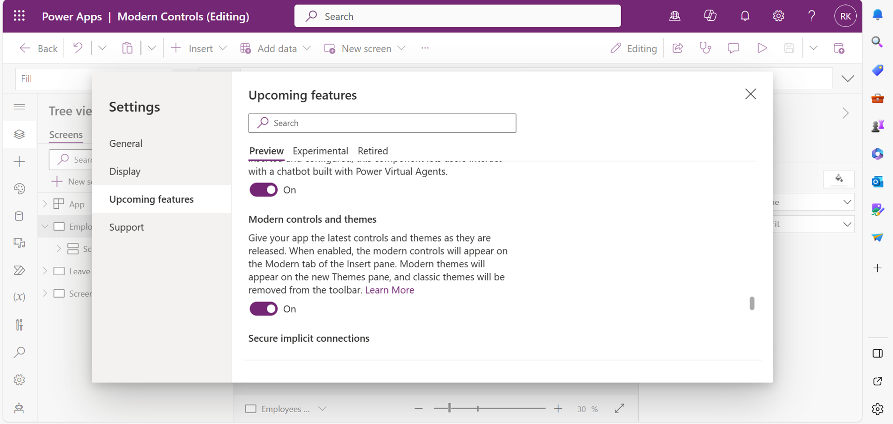
For option two, under Settings, select Upcoming features. Scroll down to Modern controls and themes, and then turn on the toggle for this new feature, as shown in Figure 2.
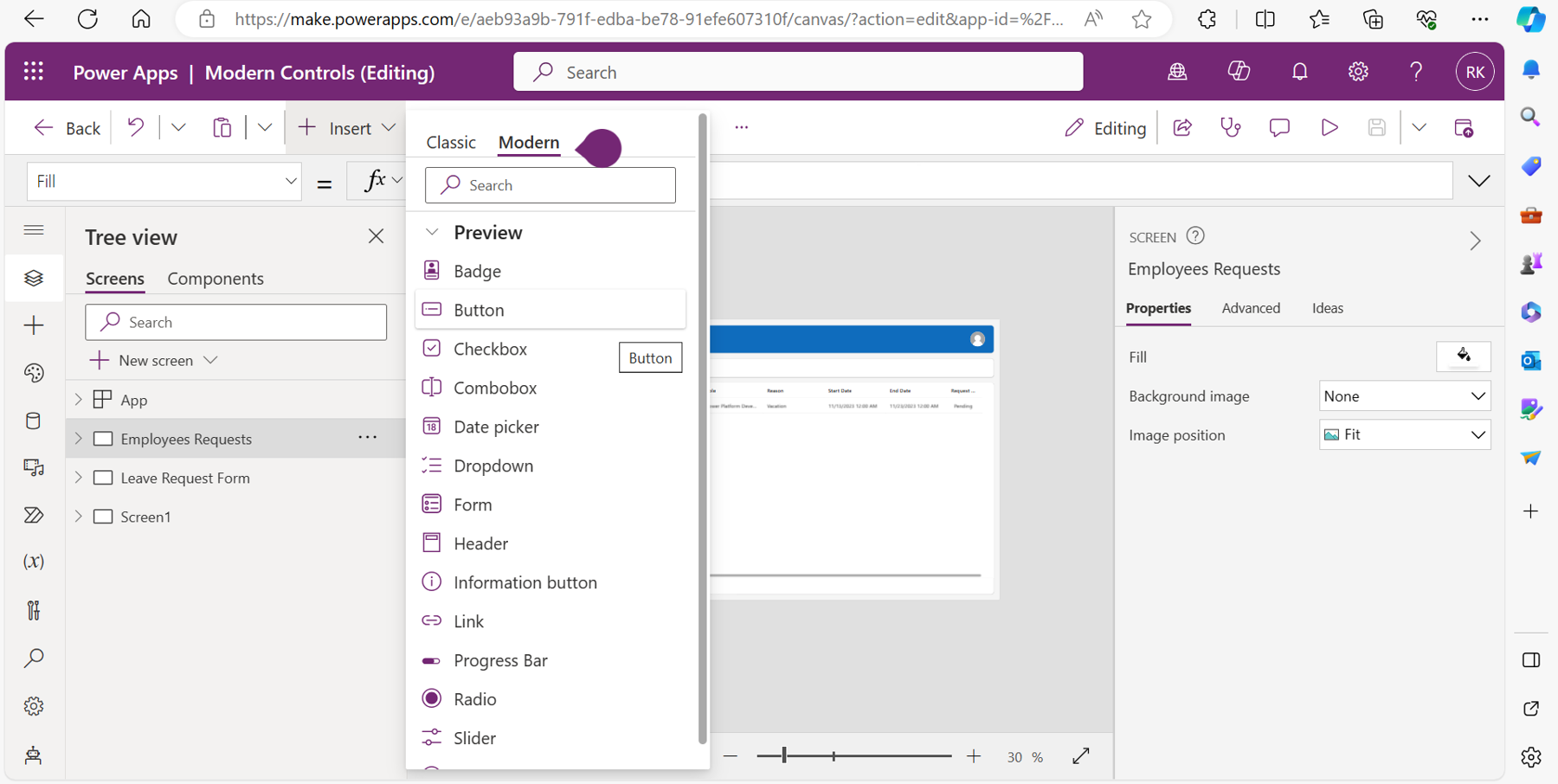
You will now have access to modern controls in the Insert ribbon of Power Apps Studio, as shown in Figure 3.
In the next section of this article, I will describe all the modern controls with use cases and examples.
Note: As of this writing, all modern controls are still in preview and new features are constantly being added. This article describes all the features currently available with the controls.
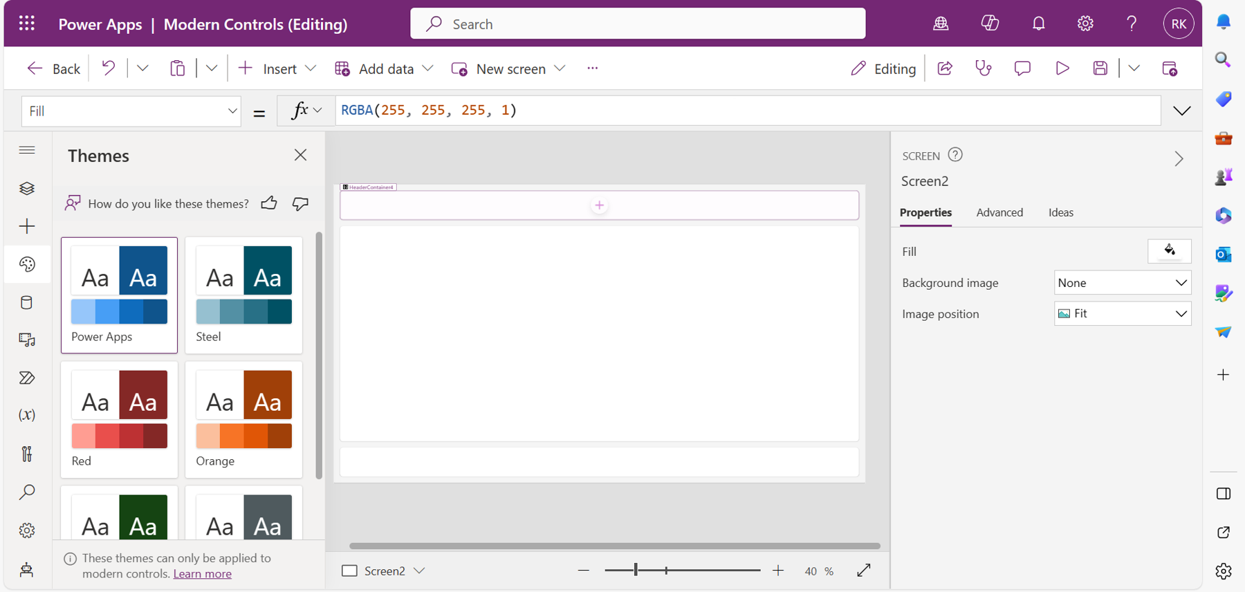
Before I delve into these modern controls, I will show how to create an application for all the demonstrations in this article. Under Other ways to create an app on the Power Apps home page, select Start with a page design. Choose the header, main section, and footer layout from the available options and create the application. On the left-hand side of the canvas studio, select Themes (below the + icon), and then select the modern theme of your application. All the modern controls used in the app will inherit the color of the selected theme by default. Your app should look like Figure 4.
Modern Header Control
The header control allows you to design a standard header for your application’s screens. You can add a page title, image, and logo to the screen. It is highly responsive and inherits the color of the theme used with your application.
To add the control to the canvas app, select the + icon on the header container of your app. A list of modern controls will pop up. Select the header control, and you will notice that it automatically adjusts to the width of the header container. This is because, by default, the width is set to inherit the parent’s width, which is the header container in this case. Your header should look like Figure 5.
Properties of Header Control
Title: Allows you to add the title of your page in the header. The control is automatically set to inherit the name of the current screen but can be customized from the formula bar. You will enter the title as text inside two double quotations, and the title will automatically change to the new value defined.
Logo: Allows you to add a logo to the header. This can be a logo of your organization or business. To add the logo, select the drop-down menu of the logo, and then choose Add image file. A new tab will open for you to choose the file from your computer. With the image chosen, the logo updates itself on the canvas header.
Style: Has three options—primary, light, and neutral. When the primary is selected, the control automatically inherits the color of the modern theme. If light is selected, it will have a lighter shade of the theme’s color. If neutral is selected, the control will have a plain color. By default, the primary option is selected.
Base palette color: Defines the color of the control, which affects all aspects such as the fill, border color, and behavior when hovering over the control. If the value is not selected, the control inherits the color of the theme by default.
IsTitleVisible: Hides or shows the title in the header. You can set this property to two values—true or false.
IsProfileVisible: Allows you to hide or show the profile in the header. Also set to true or false.
IsLogoVisible: Allows you to show or hide the logo in the header. Also set to true or false.
TitleFontSize: Specifies the font size of your title. By default, it is set to 20. It can be set to dynamically change depending on the size of the screen using the switch function. For example,
Switch(Screen2.Size,1,10,20)
This function will change the title's font to 10 if the screen value is set to 1 (a mobile phone screen) and will switch to 20 for all other sizes.
Profile picture: When turned on, it displays the image of the currently logged-in user. When you hover over the image, the name of the user pops up; when the image is selected, the full name and the email of the user is displayed.
With the logo image added, and the title whose font changes depend on the screen size, your header should look like Figure 6.
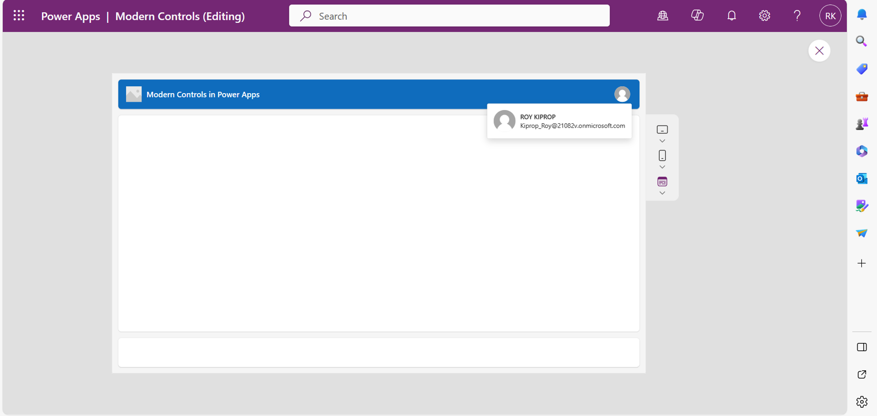
| Used with permission from Microsoft.
The modern header control does not automatically replicate itself on other screens used within the app. You will have to add the control on each screen manually.
Modern Information Button Control
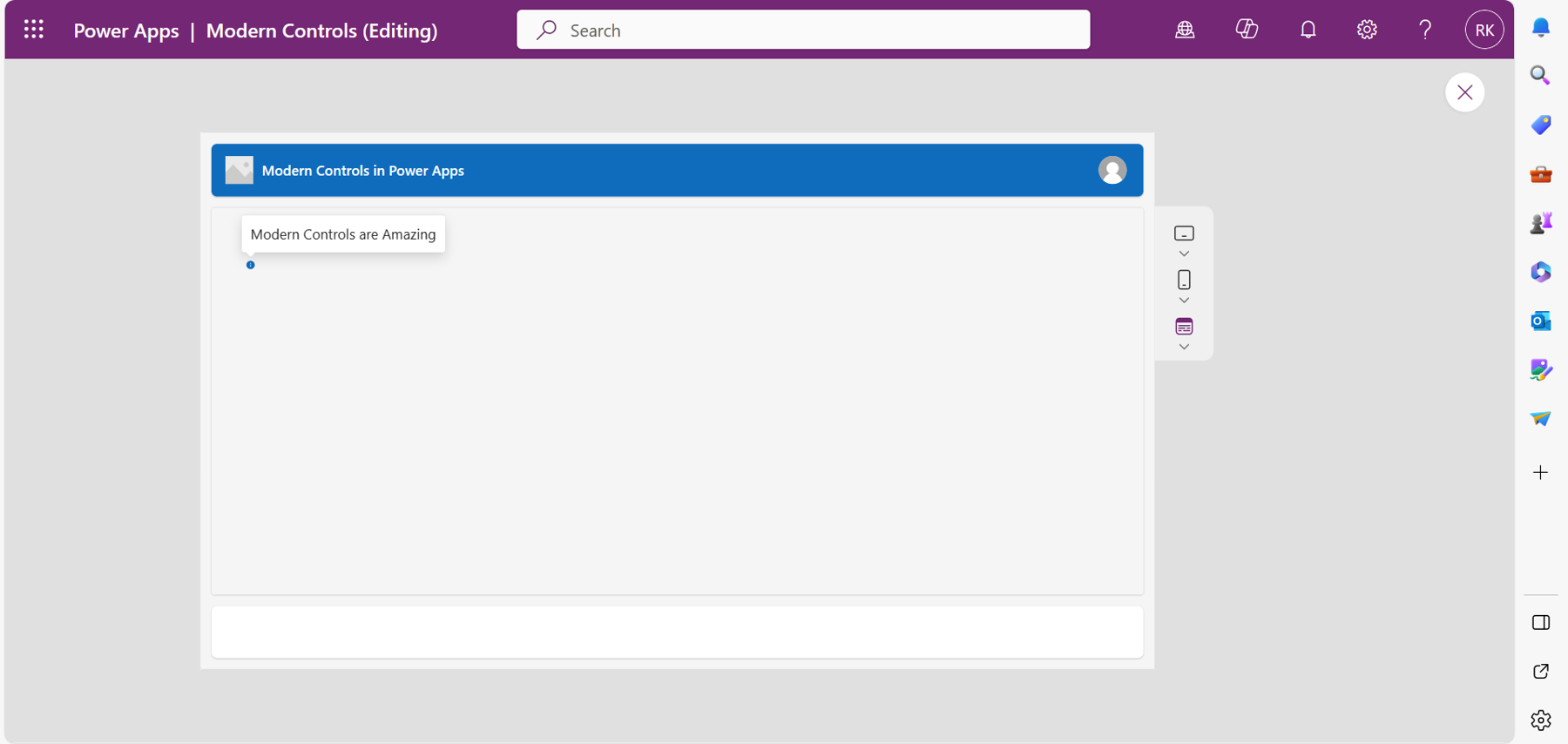
Information button control gives additional information to users of the application. Makers can utilize this control to guide users on how to do something in the app by simply adding the details on the control. When selected, the information pops up.
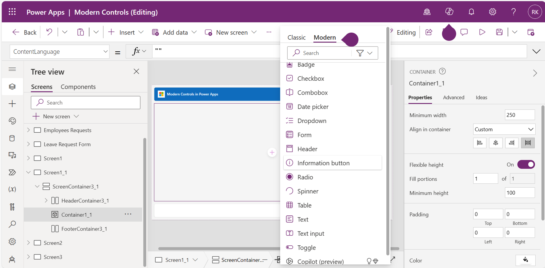
To add the control, select the main body container and add the control under modern controls, as shown in Figure 7.
Properties of Information Button Control
Content: Enables you to add the information you want the users to see when they select the control.
Icon size: Has three options—large, medium, and small. You can change the size of your icon using these three options.
Display mode: Can either be set to edit if you want the user to edit the information displayed by the control, view to only display the data to the user, or disabled to make the control in the app unavailable.
Accessible label: Used for screen readers; this enables alternative ways of interacting with controls for persons with disabilities.
Base palette color: Defines the color of the control, which affects all aspects such as the fill, border color, and behavior when hovering over the control. If the value is not selected, the control inherits the color of the theme by default.
Font size: Changes the font size of the information displayed by the control. By default, it is set to 20.
When you add content to the control, it should look like Figure 8 when selected.
Modern Tab List Control
The tab list control allows users to navigate from one page to the other while on the same canvas application.
Properties of a Tab List Control
Items: Allows you to add a list of items that the tab list will display for the user to select. These items can be an array of data (which is specified in the formula bar) or a data source column (which is added by connecting the tab list to a data source).
Views: Allows you to select the view to be displayed as items from a data source.
Fields: Allows you to select the fields from a data source or array of data to display as items in the tab list.
Size: Has three options—large, medium, and small. It allows you to specify the size of the items in the tab list.
Base palette color: Defines the color of the control, which affects all aspects such as the fill, border color, and behavior when hovering over the control. If the value is not selected, the control inherits the color of the theme by default.
Alignment: Allows you to change the display of the items in the tab list to show in either horizontal or vertical manner.
Visible: Hides or shows the control in the app. You can set to true or false.
OnChange: Specifies the actions that happen when the value of the control is changed.
OnSelect: Specifies the actions that happen when the control is selected.
Using a Tab List Control in Power Apps
One use case of a tab list in Power Apps is to group the data cards of a form into different tabs. Here is an example of a form control in Power Apps used by a manager to record the details of new employees and submit them to a Dataverse table.
Step One: Add an Edit Form to Your App and Connect It to the Dataverse Table
Your app should look like Figure 9 when you select the fields of the Dataverse table connected to the form.
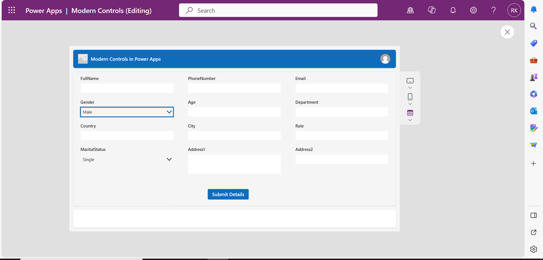
Make sure to change the form's mode from edit to new (using the mode property) to allow for the addition of new data.
Step Two: Add a Tab List to Group the Fields in the Form
Under modern controls, choose the tab list. On the items property, create a simple table with records to define the name of the items in the tab, each with an assigned value. The function should look like the following:
Table(
    {
        Name: "Personal",
        Value: 10
    },
    {
        Name: "General",
        Value: 20
    },
    {
        Name: "Additional info",
        Value: 30
    }
)
This function defines a tab list with three items—General, Additional info, and Personal—each with an assigned value to categorize the cards in the form.
Step 3: Add the Fields into the Tab List
Using the control key, multi-select the fields in the form (from the tree view on the left-hand side) and on the Visible property of the fields, use the following function, which sets the chosen fields to be visible only on the selected tab list whose value is 10:
TabList1.Selected.Value = 10
For example, in Figure 10, I have chosen specific fields from the form and grouped them under the Personal tab so that when the tab is selected, it will display those fields only.
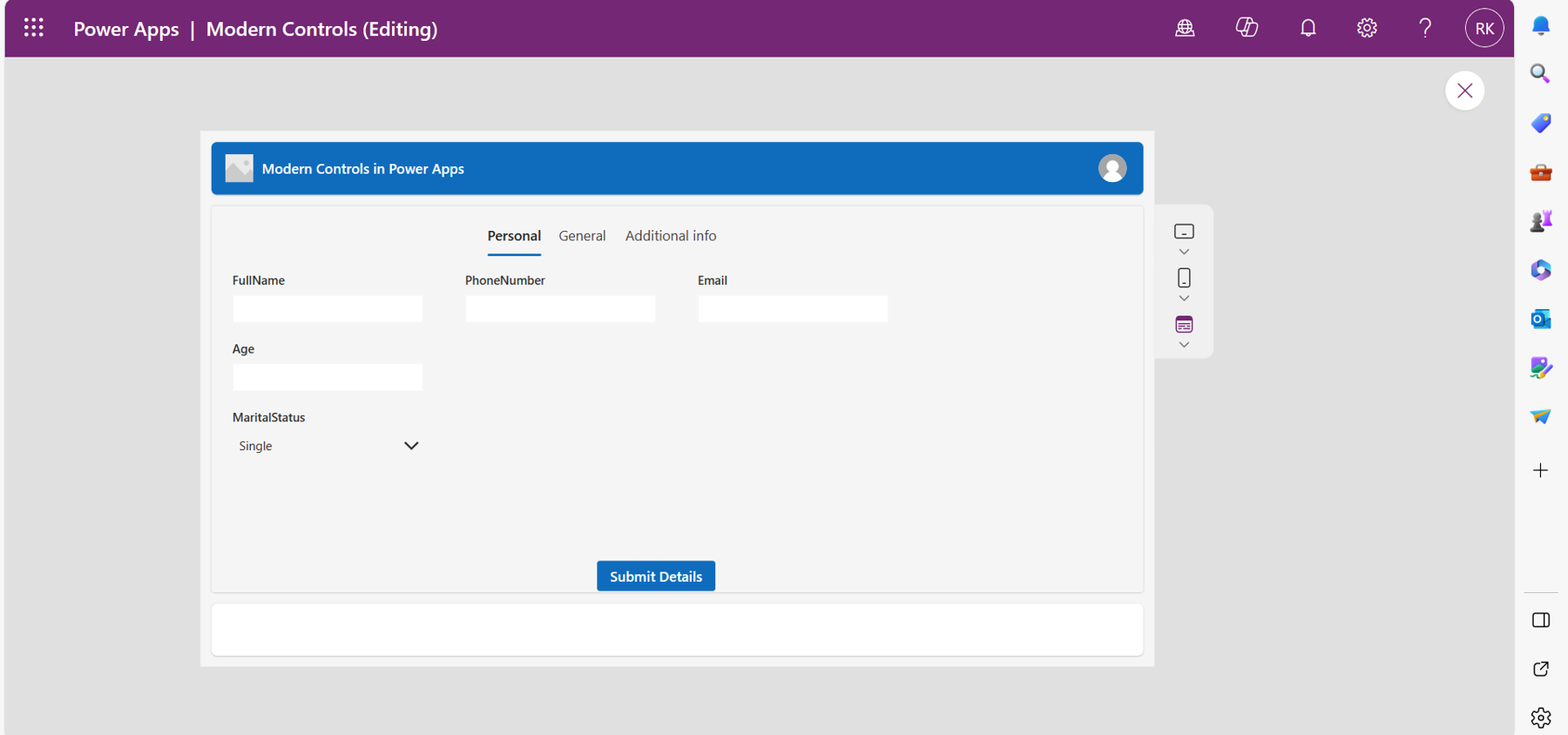
This applies to other tabs as well and makes the form look neat with few cards displayed.
Text Input Control
This control allows you to enter text or any data in the app. The control has a distinctive look and feel compared to the classic text input.
Properties of Text input Control
Placeholder text: Allows you to add default text that disappears when the user starts to enter data into the control.
Mode: Can be in single line or multiline mode depending on the length of text.
Type: Defines the type of the text control. It supports password, search, and text types. The characters are hidden by default when the user is entering a password type.
Display mode: You can set to edit mode to allow one to type in anything, view mode to only display the characters, or disabled to make the control and the characters unavailable.
Base palette color: Defines the color of the control, which affects all aspects such as the fill, border color, and behavior when hovering over the control. If the value is not selected, the control inherits the color of the theme by default.
When this control is selected, a line having the same color as that of the modern theme or the color specified by the base palette color property appears. This makes the control have a distinctive look and feel.
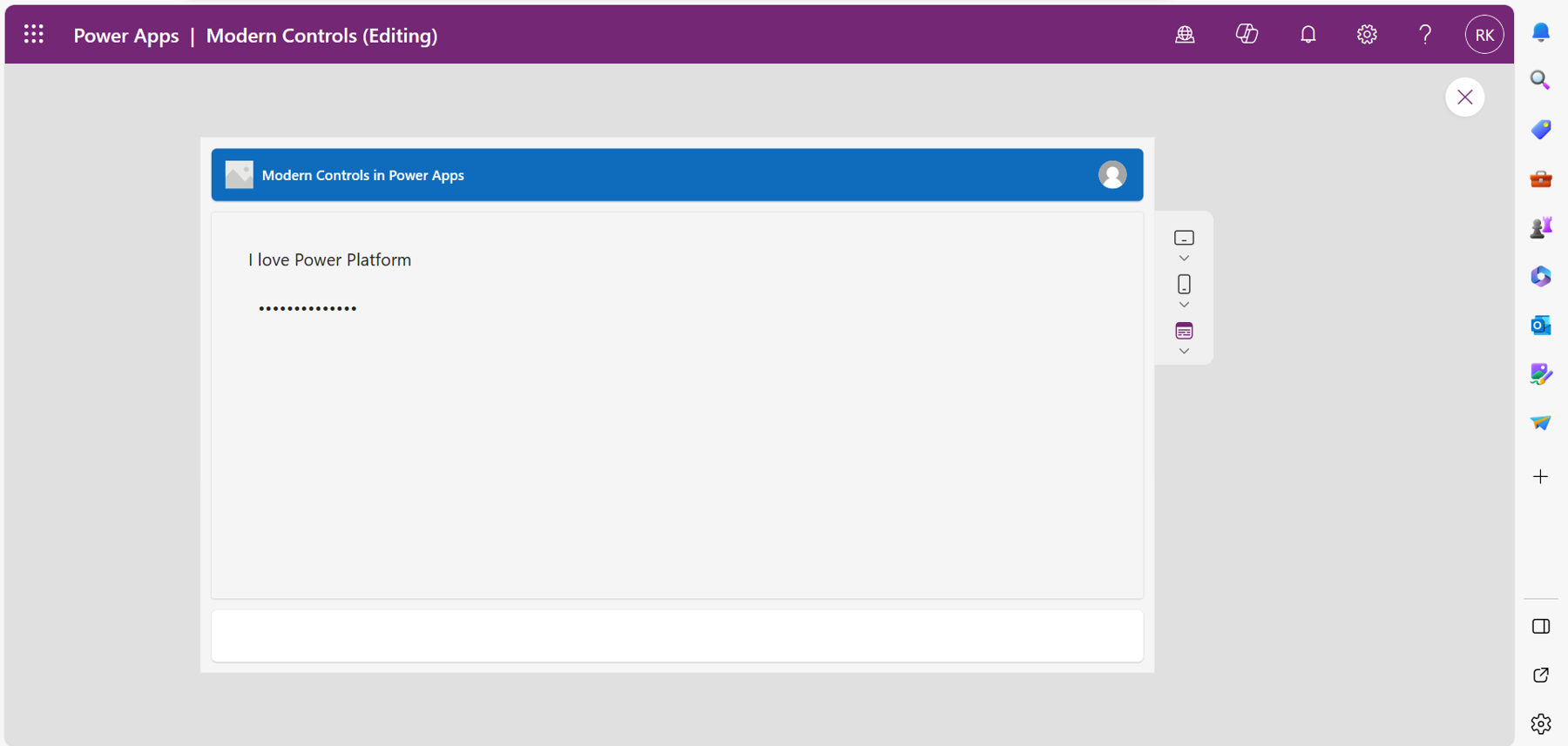
You can always change the font size of the text in the control using the Font-size property.
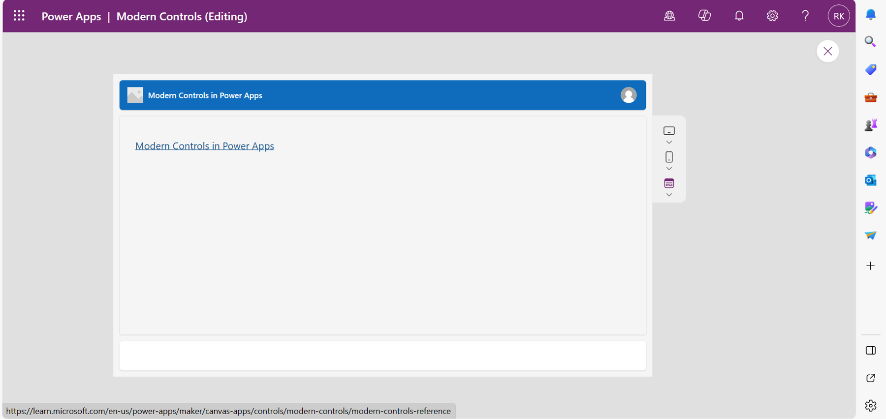
Modern Link Control.
This control allows you to add a link in the canvas app, which opens in a new tab when selected. It comes with added designs compared to the classic control to enhance the user experience and increase the visual appeal.
Properties of a Link Control.
Text: The text that is displayed on the app with the link.
URL: Allows you to add the link that navigates the user to a different site.
Align: Defines the horizontal positioning of the text in the control. Can be set to Start, End, Justify or Center.
Vertical align: Defines the vertical positioning of the text in the control. Can be set to Top, Middle, or Bottom.
Base palette color: Defines the color of the control that affects all aspects such as the fill, border color, and behavior when hovering over the control. If the value is not selected, the control inherits the color of the theme by default.
Display Mode: Defines the mode of the control. Can be set to view to only display, edit to allow editing, or disabled to make the control in the app unavailable.
Accessibility label: For screen readers so that persons with a disability can use the app.
Visible: Hides or shows the link control in the app. Set to true or false.
Auto height: Adjusts the height of the control to fit the height of the text.
Wrap: When turned on, it displays a long text in two or more lines depending on the width of the control instead of using a single line.
By default, the control inherits the color of the theme, as shown in Figure 12.
Modern Date Picker Control.
Just like the classic date picker, the modern date picker control allows users to select a specific date with an improved look, feel, and experience. With the classic control, users are required to select the OK button to update the date. With modern control, the date is automatically updated when selected.
Properties of Date Picker Control
Placeholder text: Allows you to add a default text such as “Please select the date...”
Format: Defines the format of the selected date. Short format displays the date without excluding the day of the week while LongAbbreviated and YearMonth will include the day of the week and month in an abbreviated format, for example Fri, Nov 10, 2023.
Display mode: Defines the mode of the control. Can be set to view to only display, edit to allow editing, or disabled to make the control unavailable.
Base palette color: Defines the color of the control that affects all features such as the fill, border color, and behavior when hovering over the control. If the value is not selected, the control inherits the color of the theme by default.
Font size: Specifies the size of the font used to display the date.
Accessible Label: Used for screen readers.

From Figure 13, notice the new look of the control compared to the classic control. The month and year are on the left and can be scrolled using the up and down arrow keys.
Modern Drop Down Control
This control allows the user to select an item from a list. Compared to the classic Drop down control, it has a more visually appealing design, which improves the user experience.
Properties of the Modern Drop Down Control
Items: Allows you to define the data for the Drop down control by connecting to a data source or creating a table with record of values in the formula bar.
Fields: Allows you to select the fields from a data source or array of data to display as items in the Drop down control.
Required: When turned on, the control must contain a selected value.
Display mode: Defines the mode of the control. Can be set to edit, view, or disabled.
Base palette: Defines the color of the control that affects all aspects such as the fill, border color, and behavior when hovering over the control. If the value is not selected, the control inherits the color of the theme by default.
Font size: Specifies the size of the font used with the items in the Drop down control.
Accessible label: Used for screen readers.
Using a Drop Down Modern Control in Power Apps.
In a canvas application, the Drop down control can be used in different scenarios. In this example, I will use it to filter the data displayed in a gallery control to show the data that is specific to the selected item only.
I have two lists on my SharePoint site. One list stores data of all products sold by Adventure Works Cycle (used with permission), while the other list stores data of the products per category.
Step One: Connect the Data Sources to the Gallery and the Drop Down Control
Assuming you already have the gallery and the Drop down control, connect the products list to the gallery using the data source property and the product category list to the dropdown using the items property. The app will look like Figure 14.
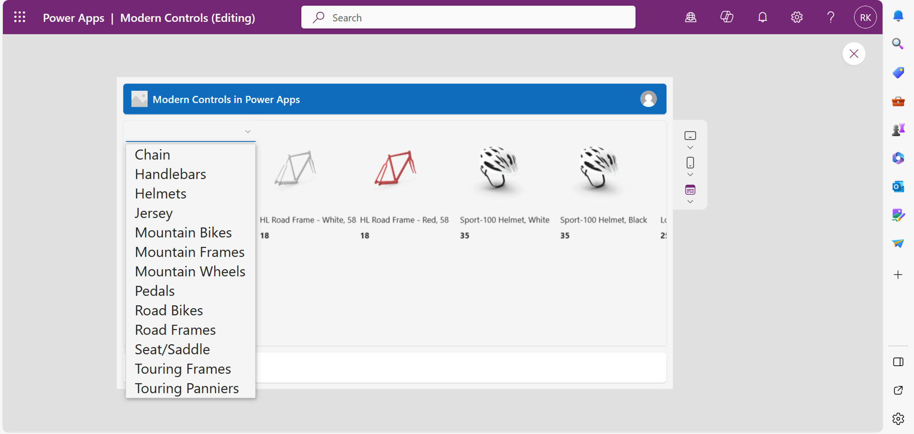
Step Two: Use the Drop Down to Filter Products in the Gallery
With the gallery and the Drop down configured in step one, add a function in the items property of the gallery that filters the products displayed in the gallery to be based on the selection of the Drop down. To achieve this, use this function:
Filter(
    'Adventure Products',
    ProductCategory = DropdownCanvas2.Selected.'Category ID'
)
From the preceding function, when you select a product category in the Drop down control, the gallery will display all the products in that category, as shown in Figure 15.
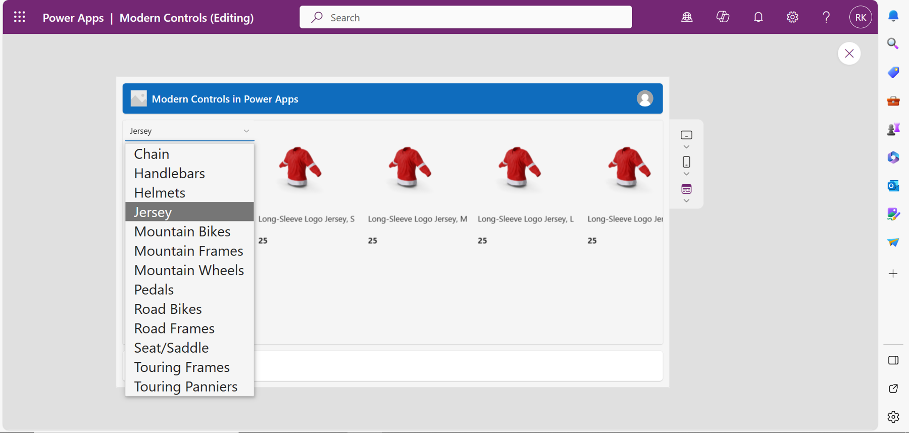
In Figure 15, all the products of the jersey category are displayed in the gallery because it is that specific category that has been selected in the Drop down. Also, all the products have the same category ID of 25.
Modern Combo Box Control
Just like the Drop down control, a Combo box allows you to select an item from a list. The difference between the two is that with the Combo box, you can select multiple items at the same time and search for the items to select.
Properties of the Combo Box Modern Control
Datasource(items): Defines the data of the Combo box.
Allow multiple selections: When turned on, the Combo box allows the user to select more than one item.
Allow searching: When turned on, the Combo box allows the user to search for items to select.
Display mode: Defines the mode of the control, which can be set to display, edit, or view.
InputTextPlaceholder: Defines the default text that shows up with control such as “Find Items,” or “Search Items.”
MultiValueDelimiter: Defines the character used to separate the items that have been multiselected.
Base palette: Defines the color of the control that affects all aspects such as the fill and border color, and behavior when hovering over the control. If the value is not selected, the control inherits the color of the theme by default.
Using the Modern Combo Box in Power Apps
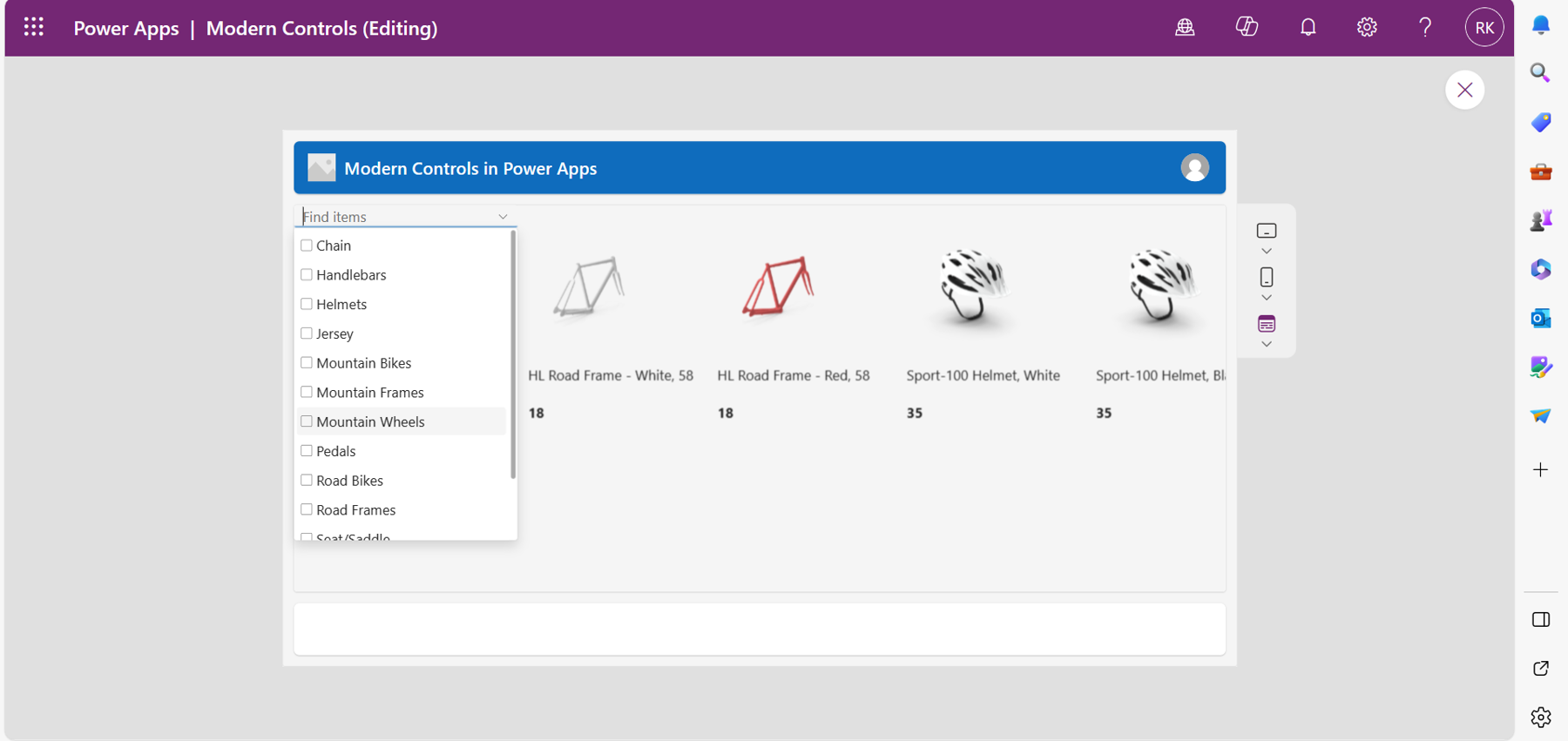
In the previous section of this article, I used a Drop down control to filter the Adventure Works Cycle products in the gallery based on the selected item in the Drop down. In this section, I will replace the Drop down control and use a Combo box modern control. The app will look like Figure 16.
For the next step, filter the gallery to display products based on the selected category in the Combo box using the following function:
Filter(
    'Adventure Products',
    ProductCategory = ComboboxCanvas3.Selected.'Category ID'
)
Also, try to search and select multiple items in the Combo box. Your application will look like Figure 17.
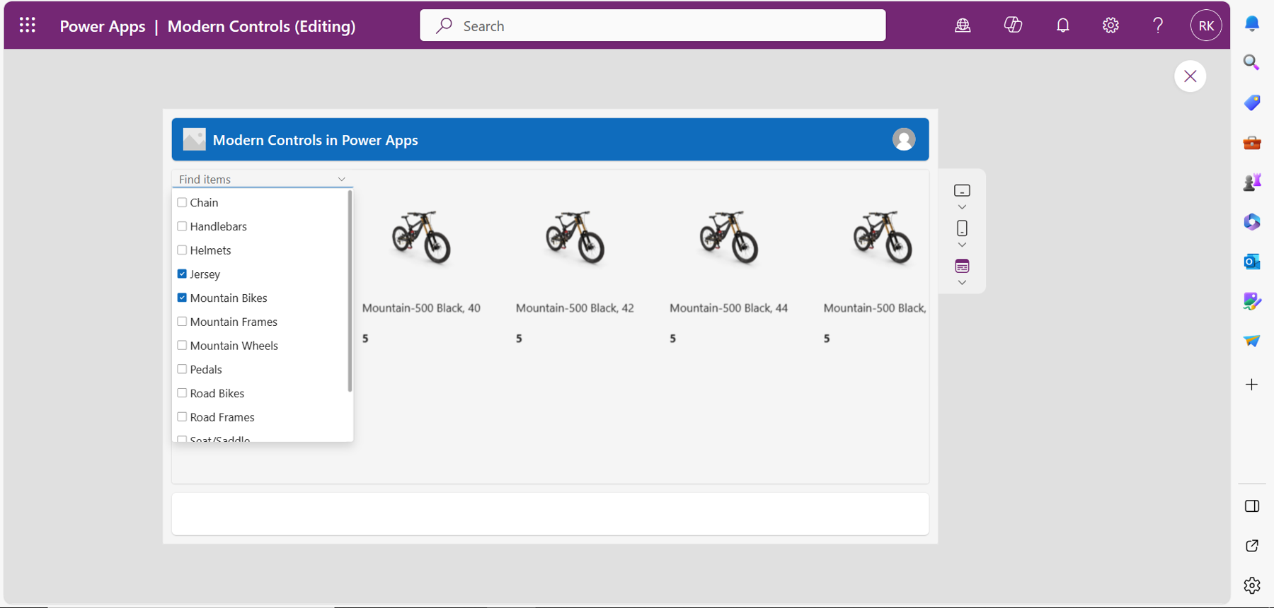
From Figure 17, you will notice that the Combo box enables you to select more than one item if the property is turned on and the selected items are separated by a comma delimiter defined in the properties pane.
Note: The modern Combo box control supports Delegation with large datasets, unlike the classic Combo box control.
Modern Text Control
This modern control is used to display text in a canvas app and labeling of controls.
Properties of a Text Control
Text: Defines the text to be displayed.
Font: Defines the font size of the text.
Font weight: Defines how dark a text will appear in the control. Can be set to Bold, Semibold, Medium, or Regular.
Align: Defines the horizontal position of the text in the control. Can be set to Start, Center, End, or Justify.
Vertical align: Defines the vertical position of the text in the control. Can be set to Top, Middle, or Bottom.
Auto height: Adjusts the height of the control to fit the height of the text.
Wrap: When turned on, it displays a long text in two or more lines depending on the width of the control instead of using a single line.
You can also change the style of your text to display it as italicized, underlined, or strikethrough.
Modern Spinner Control
This is an animated control indicating that an action such as saving or loading a page is currently taking place.
Properties of a Spinner Modern Control
Label: Defines the tag for the spinner such as ‘Saving...’ or ‘Loading...’
Appearance: Defines the appearance of the spinner. You can think of it as the Fill property in classic controls. Can either be set to primary or inverted.
Label position: Defines the label's position with respect to the spinner. It can be below, above, after, or before the spinner.
Spinner size: Has options that define the size of the spinner.
Base palette color: Defines the control color, which affects all aspects like the fill. If the value is not selected, the control inherits the color of the theme by default.
Font_Size: Defines the font size of the label.
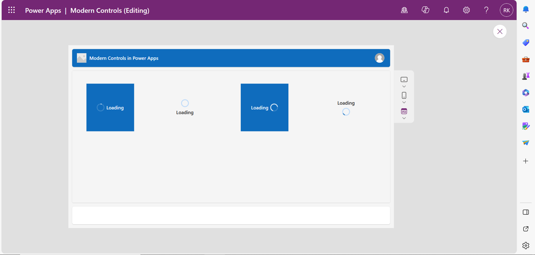
From Figure 18, I have illustrated the different spinner controls according to the label arrangement. You will also notice that there are two transparent spinners. This is because their appearance is set to Primary.
Modern Slider Control
The slider control allows you to define a value by moving the handle of the slider. The value can be used to perform an action, depending on your use case in Power Apps.
Properties of a Slider Control
Value: Defines the default value of the slider indicated by the handle position.
Min and Max: Defines the minimum and maximum values the slider can be set to.
Layout: Defines the direction of the slider. Can be set as Vertical or Horizontal.
Size: Defines the size of the control, which can be set to either small or medium.
Base palette color: Defines the color of the control that affects all aspects such as the fill and border color. If the value is not selected, the control inherits the color of the theme by default.
OnChange: Defines the actions that happen when the value of the slider changes.
Modern Progress Bar Control
The progress control is used to indicate the progress of an action such as downloading a file, loading a page, etc.
Properties of the Progress Bar
Thickness: Defines the breadth of the progress bar which can be set to Large or Medium.
Shape: Defines the shape of both the bar and the track. Can be set to Rounded or Square.
Indeterminate: When turned on, the bar will keep scrolling the entire width of the control until the action is done. When turned off, the control is in a determinate state and the bar will show the exact progress of the action.
Base palette color: Defines the color of the control, which affects all aspects such as the fill, border color, and behavior when hovering over the control. If the value is not selected, the control inherits the color of the theme by default.
Progress color: Works only with a determinate progress bar to indicate the state of the bar by displaying distinct colors. Can be set to Brand, Success, Warning, and Error. For an indeterminate progress bar, regardless of the selected progress color, the control will inherit the theme’s color or the selected base palette color.
OnChange: Defines the action that happens when the value of the control changes.
Visible: Shows or hides the control.
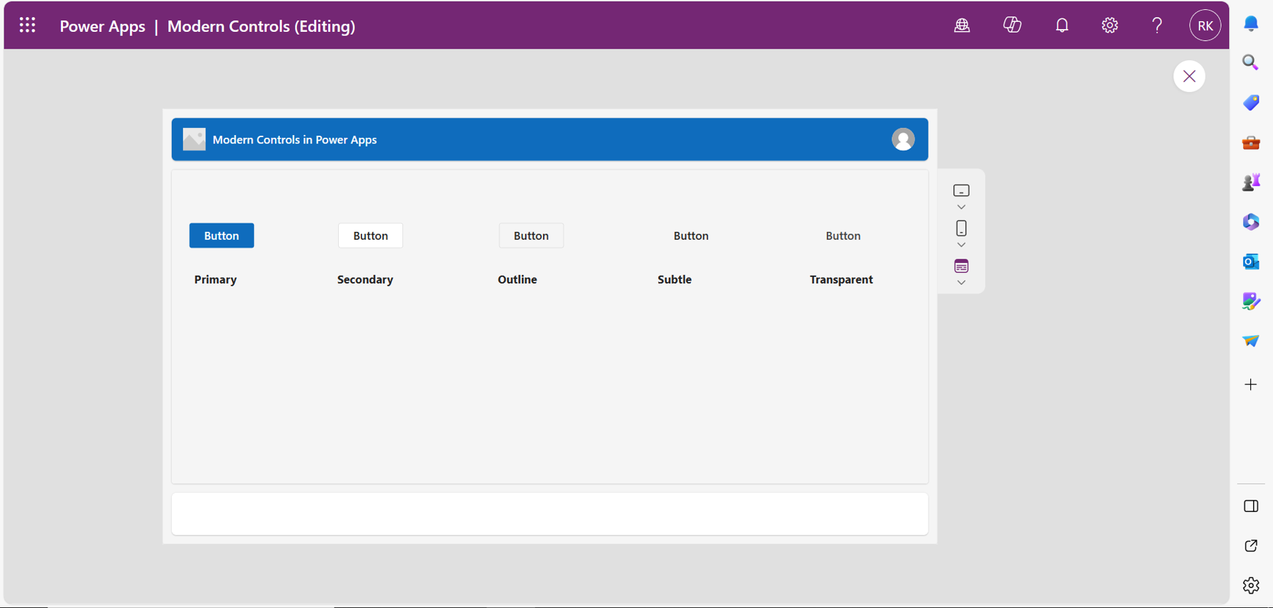
Modern Button Control
This control performs actions such as navigation in Power Apps when selected.
Properties of a Button
Text: Defines the text displayed on the control. For example, a button used to submit a form will have text like “Submit Form.”
Type: Defines diverse types that can be used with the button for different customizations. Can be set to Primary, Secondary, Outline, Subtle, or Transparent.
Display mode: Defines the mode of the control. Can be set to edit, view, or disabled.
Base palette color: Defines the color of the control, which affects all aspects such as the fill, border color, and behavior when hovering over the control. If the value is not selected, the control inherits the color of the theme by default.
Font size: Defines the font size of the text in the control.
Visible: Shows or hides the control.
OnSelect: Defines the action that happens when the user selects the button using the Power Fx functions.
Several types of modern button control are illustrated in Figure 19. I have included the labels for each appearance type below the button using the modern text control.
Modern Form Control
The form control in Power Apps enables users to add new data, edit existing data, or display data from a data source depending on the mode of the control. Compared to the classic form, it has a distinctive look, feel, and experience. The control uses modern controls such as the text input, date picker, and the Drop down to edit, display, and add data.
Properties of Modern Form Control
Data source: Defines the records to be displayed, edited, or created by the user.
Fields: Allows you to select the fields to display on the form as data cards.
Snap to columns: Allows you to arrange the data cards in column form.
Columns: Defines the number of columns to arrange the data cards.
OnSuccess: Defines the actions that happen when the form operation is successful.
OnFailure: Defines the actions that happen when the form operation is unsuccessful.
OnReset: Defines the actions that happen when the control is reset.
Visible: Hides or shows the control in the app.
Using the Modern Form Control in Power Apps
To help you understand this, here is an example. I have designed a canvas application that allows employees to request leave in a company. The details are stored in a Dataverse table created for this purpose. I will use the modern form control to allow the employees to record the request and submit it to Dataverse using the modern button control.
Step One: Add the Modern Form Control to the Canvas App
Select the form to add the control to the canvas application under modern controls. In the Properties menu, select the data source for the form, which is the Dataverse table. Select the edit fields to display the fields on the form from the table. Remember to change the mode of the form to new. This enables new leave requests to be added. Your app should look like Figure 20.

From Figure 20, you will notice that the controls such as the date picker, and text input used with the form are modern controls, giving the form a distinctive look and feel compared to the classic form control.
Step 2: Test the Form
In this step, you will add a modern button control to the app that will submit the details to the Dataverse table using a function like the following in the OnSelect property of the button:
SubmitForm(Form1);
When the button is selected, the function will submit the request details to the Dataverse table.
To ensure that the request has been submitted, in the OnSuccess property of the form, add a function that will notify the employee when the request is submitted successfully. For example:
Notify("Leave Request Submitted Successfully",NotificationType.Success, 5000)
The text defined in the preceding function pops up when the submission is successful, and the request details are recorded to Dataverse.
Modern Table Control
This control allows you to connect to a data source and display data in a tabular or list format with column headers for each field in the table. The tabular format also has a footer that shows information like the number of records in the dataset.
Properties of the Modern Table control
Items: Defines the data to be displayed by the table control by connecting it to a data source.
Fields: Allows you to select the fields from the connected data source
Allow range selection: When set to Yes, the table allows you to select a specific region of the table. When set to No, you can only select one single line at a time.
Reflow behavior: Defines the display format of the control depending on the size of your screen. The behavior can be set to Reflow, Grid only, or List only.
ShowColumnHeader: Can be set to Yes to show the column headers of the table, and No to hide the headers.
ShowFooter: Can be set to Yes to show the column footer, and No to hide the footer.
Base palette color: Defines the color of the control. If not selected, the control will inherit the color of the theme by default.
Using the Modern Table Control in Power Apps
Take the example of the leave request app in the previous section. Use the modern table control to display requests in a tabular format on the app, so that the employees can edit and see the status of their requests.
Step One: Configure the Modern Table Control
Select the table control to add it to the canvas application. On the Properties menu, select the data source for the table. Under Fields, select Edit to add the fields to be displayed on the table. Add two modern buttons to allow the employee to add and edit requests using the modern form (discussed in the previous section).
Your app should look like Figure 21.
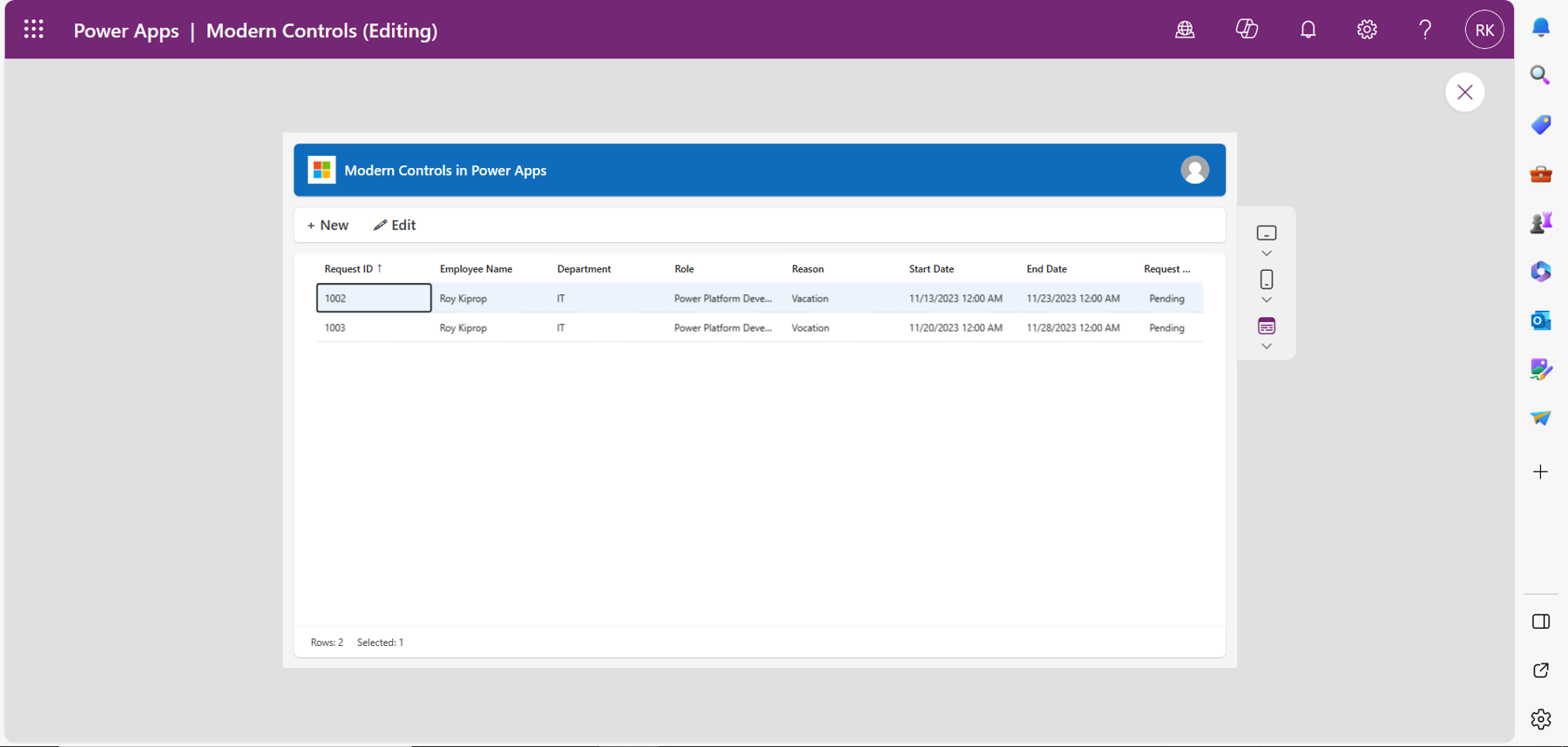
From Figure 21, the leave request for the employee is displayed in the modern table and the employee can see when the request is approved or rejected.
Step Two: Add and Edit Request
You will use a function that changes the mode of the form depending on the button and that navigates the user to that form.
For the New button, in the onselect property of the button, use the following function:
NewForm('Modern Form'); Navigate('Leave Request Form', ScreenTransition.Fade)
This function will change the mode of the form to new and navigate the user to the screen that has the new form configured. The user can then enter a new leave request.
For the Edit button, use the following function:
EditForm('Modern Form'); Navigate('Leave Request Form', ScreenTransition.Fade)
This function will change the mode of the form to edit and navigate the user to the screen that has the edit form.
To enable the user to edit the selected leave request in the modern table control, you will add a formula in the items property of the edit form that will only display the selected request to be edited by the user. The formula for this is:
'Modern Table Control'.Selected
In this case the ‘‘Modern Table Control’’ is the name of my table.
Modern Radio Control
This control provides a list of options to the user to make one single selection at a time.
Properties of the Modern Radio Control
Items: Defines the data of the control for the user to select. It can be an array of data specified or connect the control to a data source.
Fields: Allows you to select the fields to display on the control as options from a data source.
OnChange: Defines the actions that happen when the value of the control is changed.
OnSelect: Defines the actions that happen when the control is selected.
Display mode: Sets the mode of the control to either view for the user to only see the value, edit for the user to select an option, or disabled to be make the control unavailable.
Visible: Shows or hides the control in the app.
Base palette color: Defines the color of the control shown on the selected checkbox. If not selected, the control will inherit the color of the theme by default.
Using the Radio Control in Power Apps
Radio control can be used in a variety of cases in Power Apps. For example, I have a simple canvas app that a company uses to do surveys from employees. The radio control provides options for the employees as choices to the questions for them to select. Figure 22 illustrates the scenario.
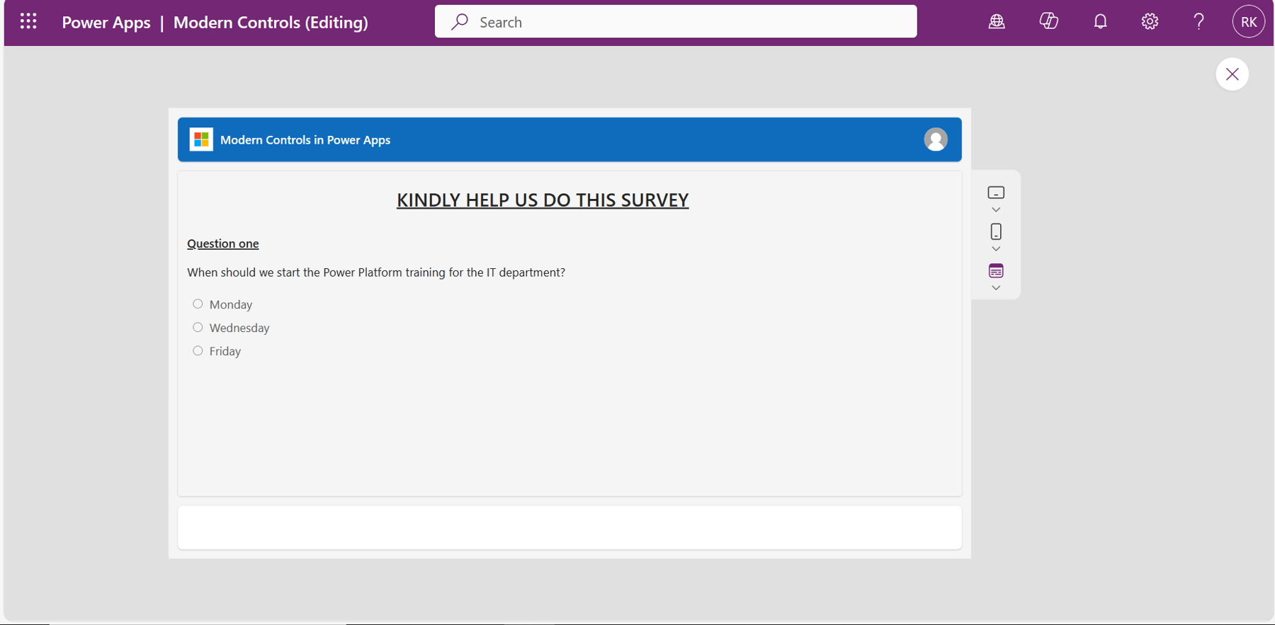
Notice that the selected radio control conforms to the color of the theme because the base palette color is not specified.
Summary
In conclusion, these new advanced modern controls in Power Apps enhance the app-building experience, helping makers develop modern applications. From the modern text inputs to modern form controls, makers can use these modern tools to redefine user interfaces and enhance the accessibility, performance, and usability of their applications.

Roy Kiprop
Roy is deeply passionate about technology, especially Microsoft Power Platform. His journey in the tech world has made him skilled in various Microsoft Power Platform tools like Power Apps, Power BI, Power Automate, Power Virtual Agents, AI, and Dataverse. He sees immense potential in these technologies for creating innovative, no-code/low-code solutions. He is currently a certified App Maker and is on a mission to exploit the full potential of the Power Platform.
Additionally, Roy takes pride in being an active Power Platform User Group Kenya member. Collaborating with like-minded individuals, he stays updated on the latest trends and continuous learning opportunities in the tech space.
He likes sharing his knowledge, insights, tips, and best practices about technology through article writing. Feel free to contact him on any of his social media handles.