How to Create Charts in Microsoft SharePoint Lists

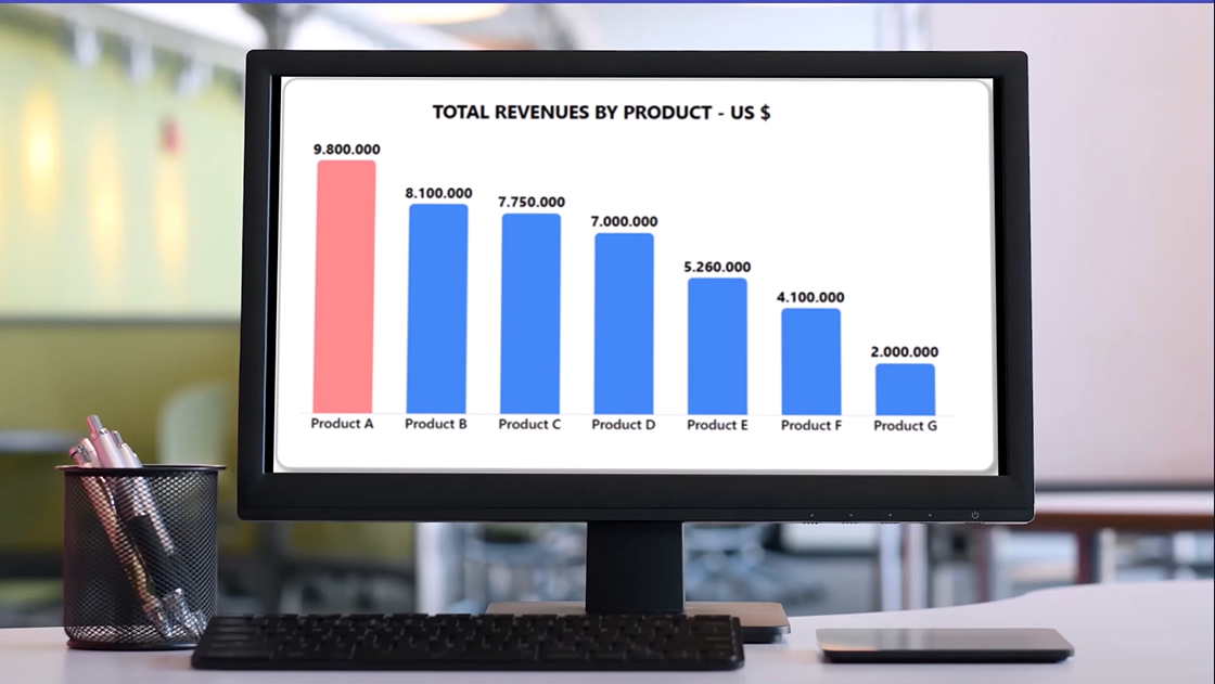
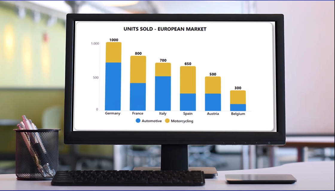
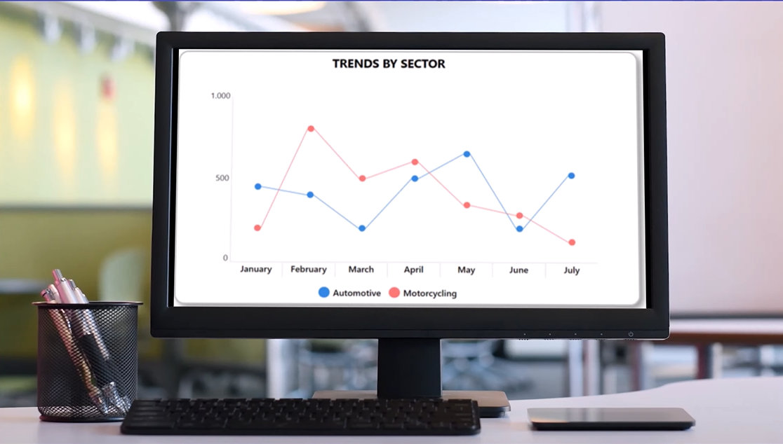
In this article I'm going to describe you how to create amazing charts in SharePoint using list view and column formatting. Check out figures 1-6 showing charts as vertical bars, doughnut charts, mixed vertical bars, pie charts, horizontal bar charts and line charts:


I think this is really impressive considering that you need just a SharePoint list to have such nice chart views. Now let's see a practical sample.
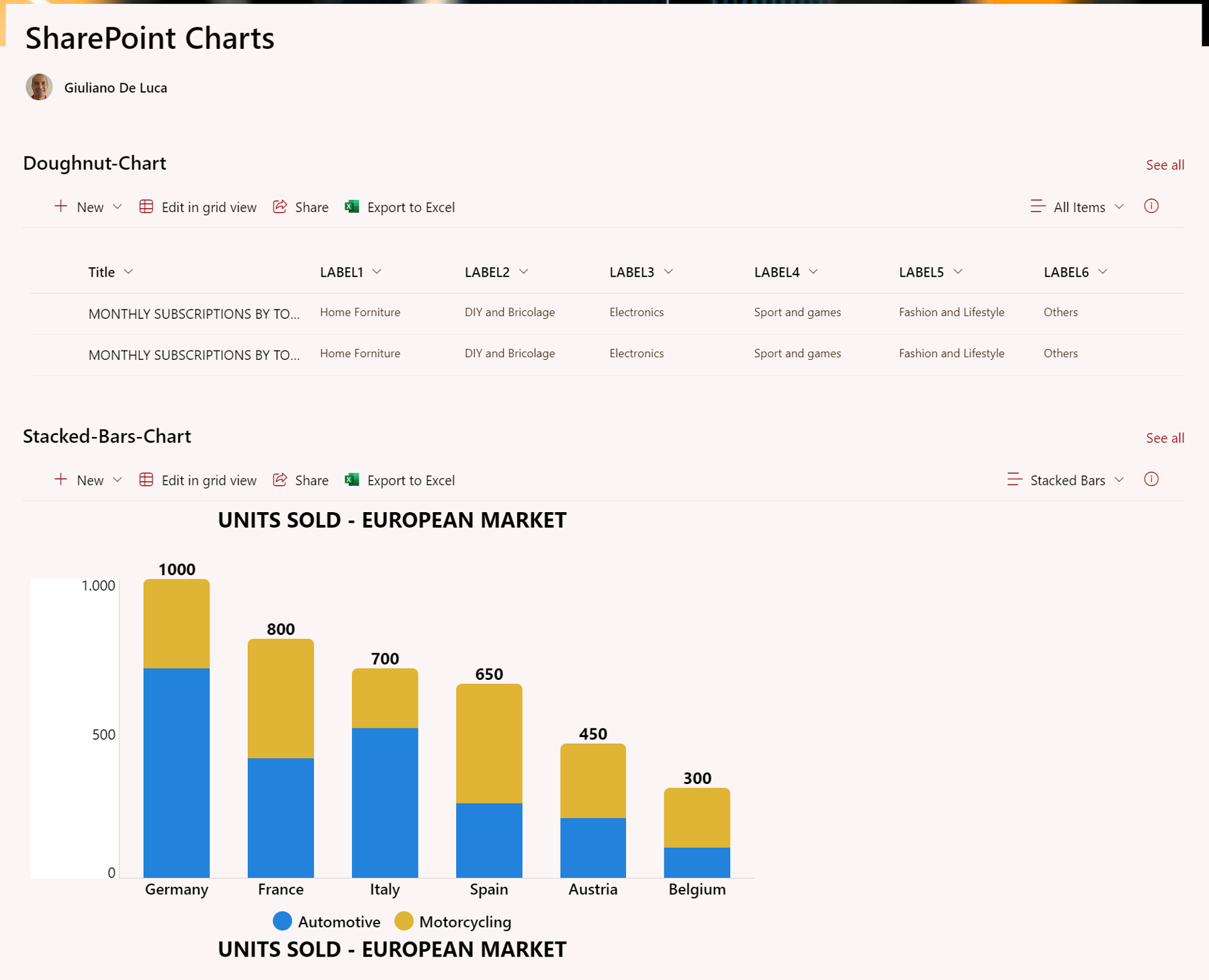
Figure 7 shows a normal SharePoint list with several columns and two items (the rows).
The nice thing about this approach is that you can have multiple charts according to the number of list items.
In my specific case I have two list items, so I'll see two charts.

What you see here is a SharePoint page with the list web part:
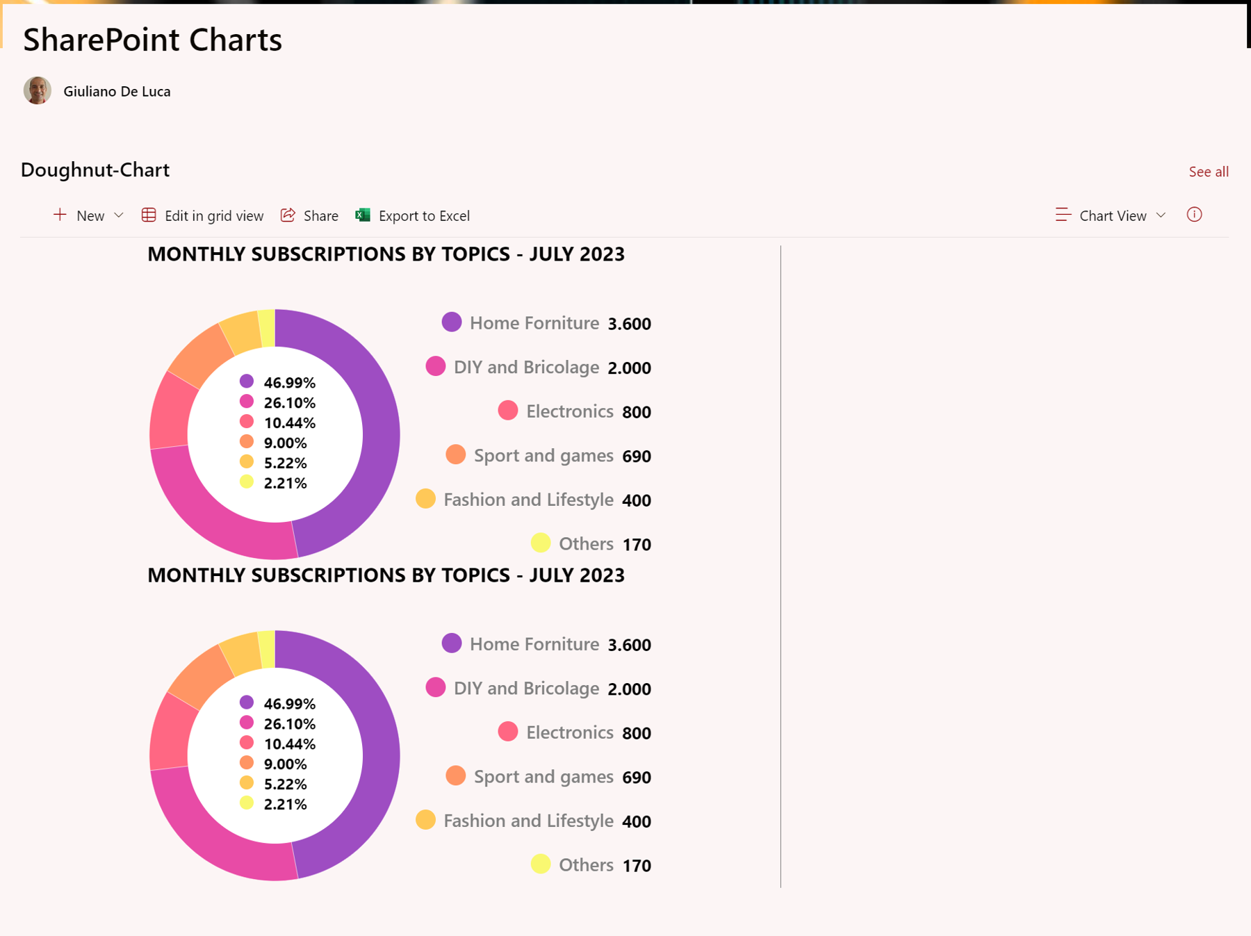
This solution is based on an open-source project available on GitHub created by Federico Sapia. Here is the link to get more insights: https://github.com/pnp/List-Formatting/tree/master/view-samples/custom-charts.
There is another useful functionality combined with the chart view which is the ability to edit every column of the list item inline, this means that you can manipulate all data and numbers directly on the chart.
Are you ready to create your charts?
Where to start
At the end of this article, I walk through an example video. You can view the video and then follow along with this article or read the article first.
Federico's GitHub project offers seven charts: doughnut, pie, vertical bars, horizontal bar, stacked bars, line chart and radar chart.
Understanding how to create the first chart will help you to figure out how to implement all other types of charts, because it is the same mechanism.
First, it's necessary to create a SharePoint list, but not from scratch. In fact, I will use an existing sample (an Excel file) that Federico includes with his GitHub project.
I'll start with the creation of the doughnut chart. Click on the link below and then on this link to an Excel file to download the proper file:
https://github.com/pnp/List-Formatting/tree/master/view-samples/custom-charts#doughnut
Now in SharePoint I will create a new list from the Excel file that I got from Federico's GitHub project and then upload to SharePoint. During the upload process, SharePoint will identify all columns. As the user you can adjust the column type suggested in the cases where what SharePoint suggested doesn't fit.
Something that you must worry about after the creation of the list is the internal name of every column. In fact, if the column internal name differs from the internal name used in the JSON, the chart view will not work.
In my case after SharePoint created the list, I had LABEL1 but field_2 as internal name, and what matters is the latter (the internal name) in the JSON.
Clearly, it's possible to create the list manually by adding all columns and selecting the most suitable internal name. However, that means you need to spend more time on the creation of the list rather than renaming some internal names to match what the JSON expects.
Creating the chart view
The next step is the creation of a new view. To do that, click on the dropdown named "All Items" when you are in the SharePoint list page.
In the panel, pick "Create new view", and type a name for your view (I called mine Stacked Bars in figure 9) and leave "List" as Show as. The checkbox to make the view public is important if you don't have that checked.
Finally, click Create.
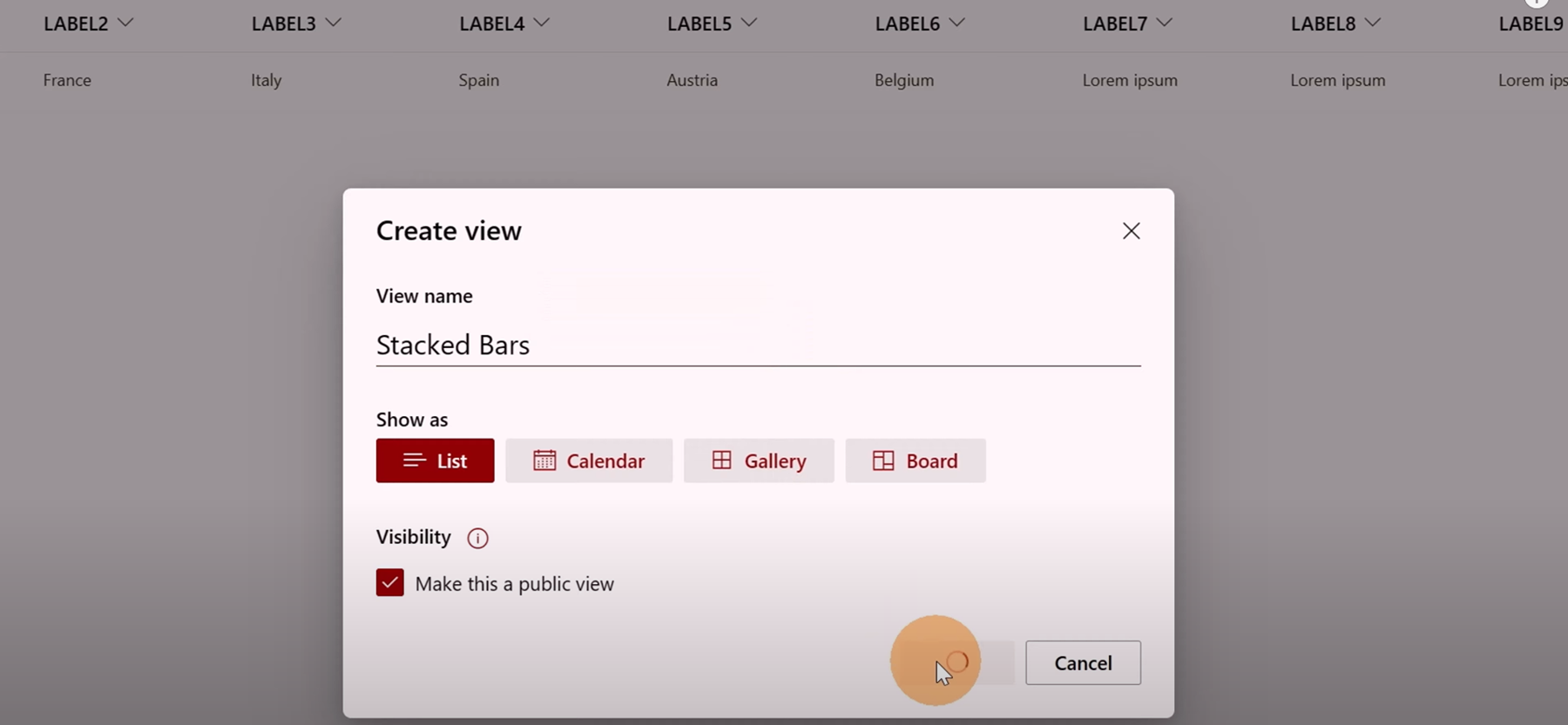
Set this new view as default so your chart will appear immediately when you open the page.
Once the new view is created, click in the dropdown to open the panel and then click on "Format current view" as shown in figure 10.
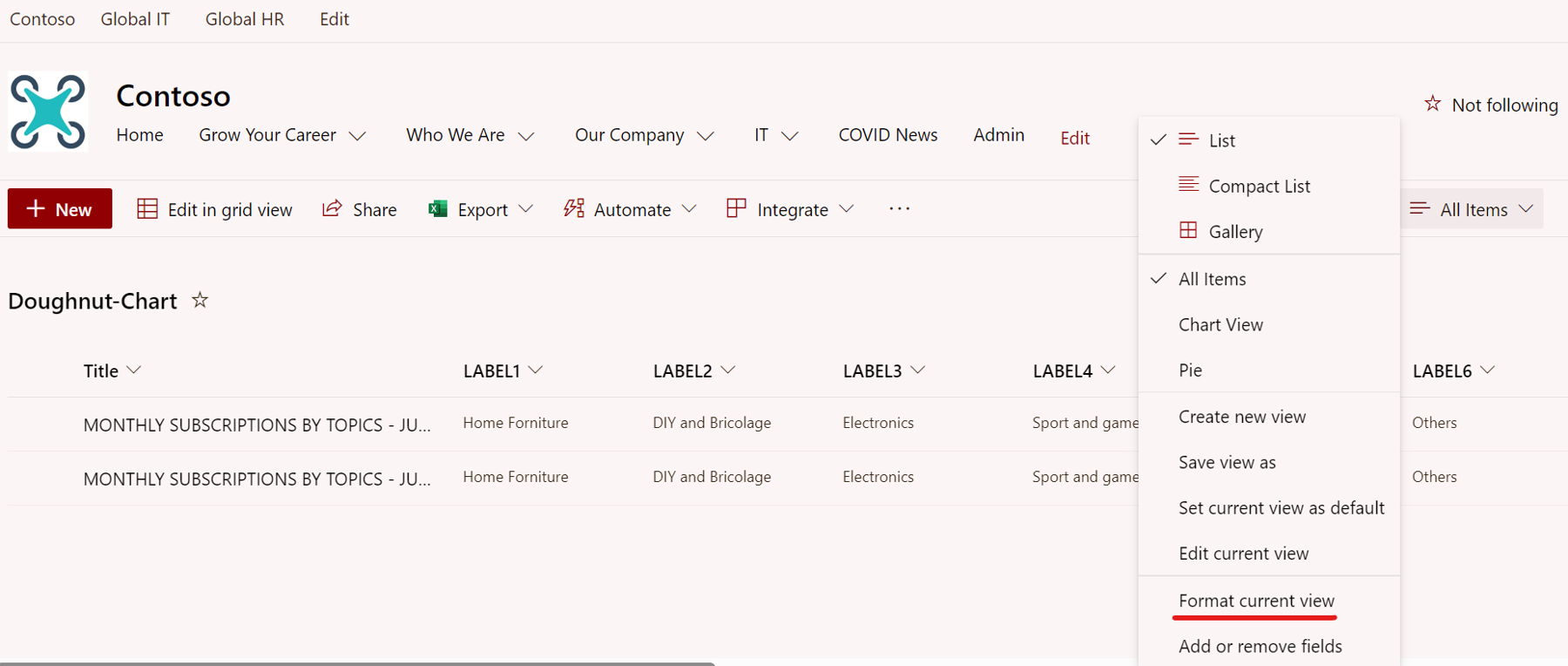
Finally, click on the visible link “Advanced mode” and here we can paste the JSON available on GitHub. In my case I am using the doughnut chart: https://github.com/pnp/List-Formatting/tree/master/view-samples/custom-charts#doughnut
Replacing the internal name in the JSON of every column with the right one in my list, I'll have this final JSON: https://github.com/giuleon/SharePointDoughnutChart/blob/main/Doughnut.json
Just for your information, all the HTML elements that make up the chart are described in the JSON, an incredible job has been done.
The incredible benefit of this mechanism is that adding a new list item we will have another chart displayed on the page; enjoy it.
My video of how to create charts from Microsoft SharePoint lists shows the steps

Giuliano De Luca
Giuliano is an Office Development MVP and specialist in Microsoft technologies for software design and development. He loves to collaborate with the community, Giuliano has passed several Microsoft certification exams and achieved the following certifications: MCSD SharePoint Applications, MCSD Web Applications, MCP, Microsoft Specialist Programming in HTML5 with JavaScript and CSS3 Specialist.
In his free time, Giuliano loves to play and explore new technologies.