On the Eighth Day of Christmas, The Waffle Brings to Me...Data On-Demand (with Power BI)

Today, as we continue our digital journey through the 12 Days of Microsoft Mayhem, let’s plunge into the world of Microsoft Power BI. Yep, I see those puzzled faces at more of those letters and acronyms. The BI in Power BI stands for Business Intelligence aka your DATA! So, what's with Microsoft Power BI, you ask? Imagine having your own personal data detective. It's that superpower right there in your Microsoft 365 toolbox, taking your data on a wild ride from chaos to clarity.
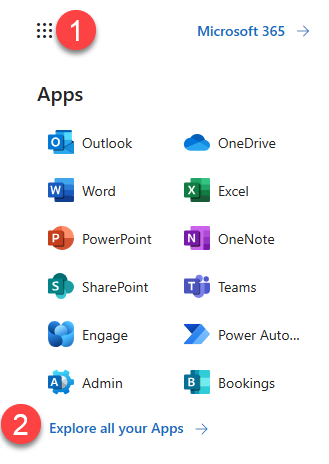
Where do you unearth this magical Power BI, you wonder? Same ol' routine: Trek on over to that waffle button in the top-left corner, as shown in Figure 1 at the number one that’s as shiny as Rudolph’s nose. Can't spot it? Click on "all apps" (at number 2) and rummage through what’s there. Trust me, it’s in there, lurking like a silent superhero ready to crunch those numbers.
When you first land, you might notice that Microsoft LOVES to rename and rebrand their stuff. If you see a funny green icon for “Fabric” (shown in Figure 2), it’s fine. You’re in the right place.

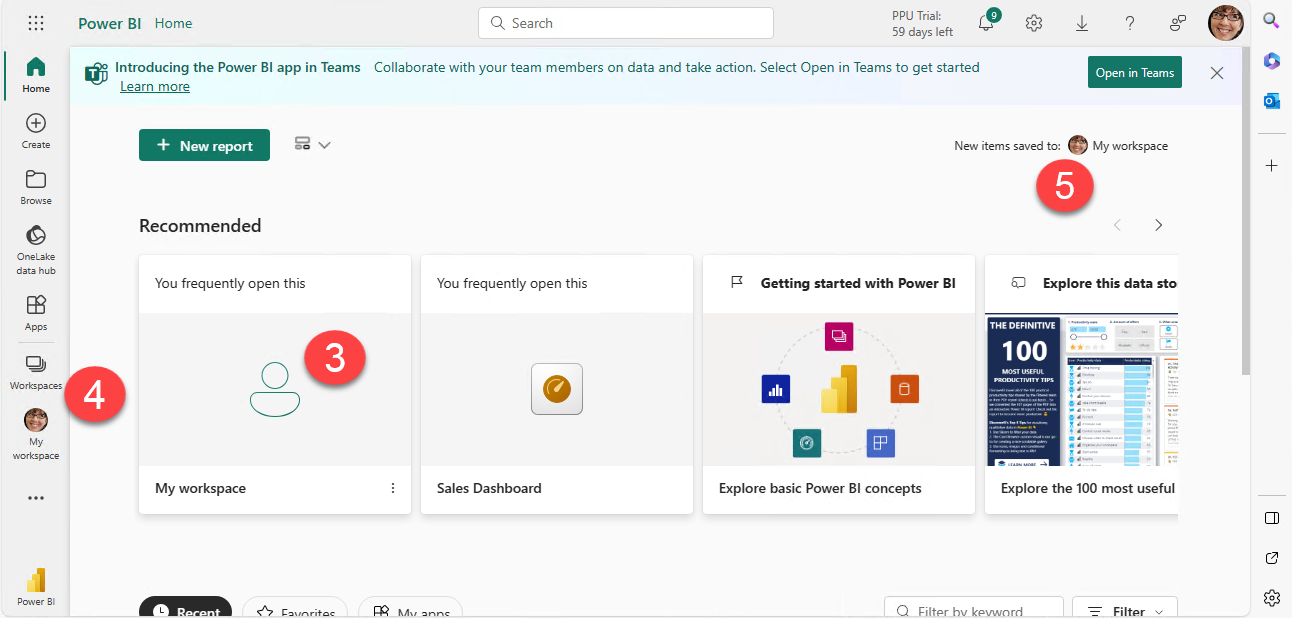
Power BI is comprised of Data Sources, Reports, and Dashboards and all of this can be found in neat little bundles under Workspaces, as shown in Figure 3. Workspaces may show up in the “Recommended” section of the page (3) or can be accessed using the links where you see your lovely picture avatar on the rail (4). The default workspace for your new items is the personal option for “My Workspace” (5).
What are the elements of a Power BI report? Here’s the rundown:
- Data sources: Yep, this is where your data calls home. Power BI connects to 'em all—spreadsheets, databases, even those lurking in the cloud. It’s the ultimate data grabber. Hey, why re-create the wheel every week/month/quarter/year if you can hit that data directly and your data is ALWAYS live.
- Reports: Dive deeper into the data trenches. Drill down, analyze trends, spot those patterns—it’s like Sherlock Holmes with a magnifying glass, uncovering the hidden gems within your data.
- Dashboards: Think of 'em as your data command center. Visualize that info, get those graphs, charts, and KPIs popping. It's your one-stop shop for a data-driven spectacle.
Here’s where the true magic happens. Workspaces are collaborative. Power BI's not a lone ranger; it's a team player. Share those insights, collaborate, and put your data on the center stage for everyone to ogle.
Not a data guru? Let Power BI do the grunt work. No more number-crunching nightmares. Let this genius automate your reports and save you heaps of time using the Q&A feature to ask for what you want in natural language, no geek-speak required. Here, let me let you in on this best-kept secret.
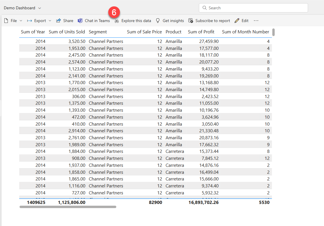
After you’ve created your first data connection, that bad boy gets published to your workspace, and then you can ask away. Check out this raw ugly data (Figure 4) that I added to a report.
If you think THAT’S an ugly Christmas sweater, click the Explore this data (6) button. The results are shown in Figure 5.
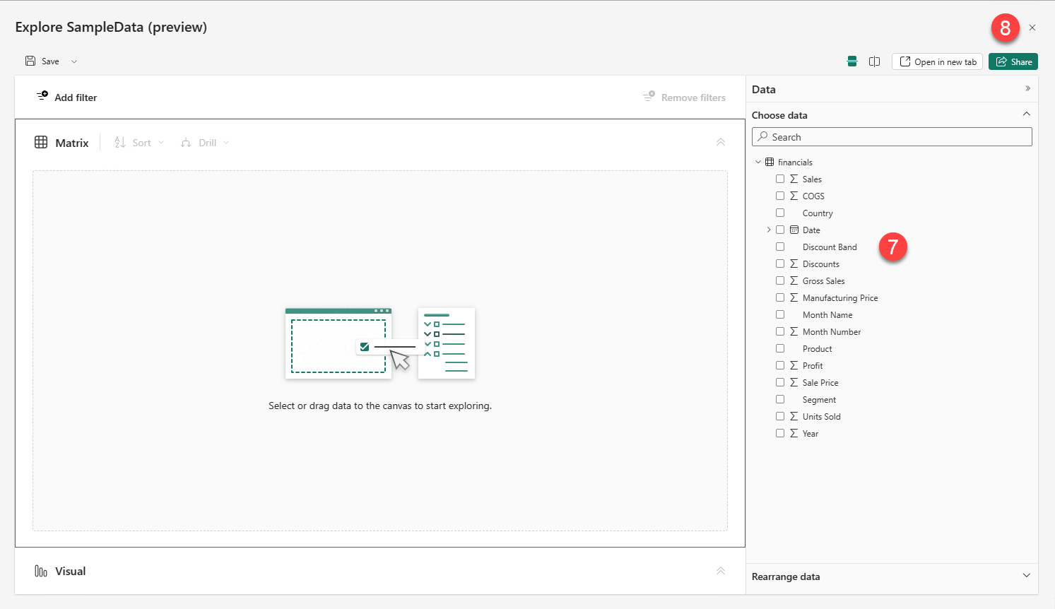
The tree view (7) gives you a great preview of the data, but it can be a little confusing if you aren’t familiar with your data. Jot down some notes on what things are called and click the Close button (8) when you’re done.
This is like peeking behind the curtain at Santa’s workshop. Although it looks a little crazy, it’s important to know what data is in your dataset for what we have in store next. I’m just going to click the close button to get this out of the way.
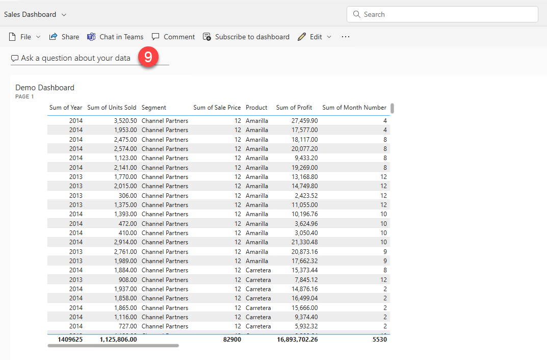
Back to business. Have you ever noticed the field at the top that says “Ask a question about your data” (in Figure 6 at number 9)? You can do exactly that! Just start typing. As you type, this smarty-pants anticipates what you might be looking for based on the data you already have! I’m just going to type “Total” and see what happens.
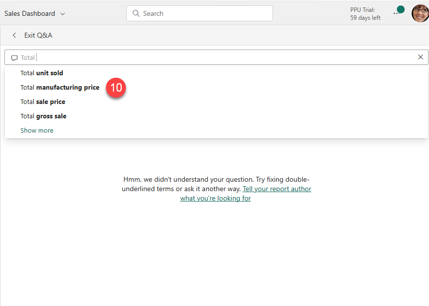
The prompts in Figure 7 give me hints about the type of information I can ask, but it still doesn’t have enough information. Options are shown at number 10.
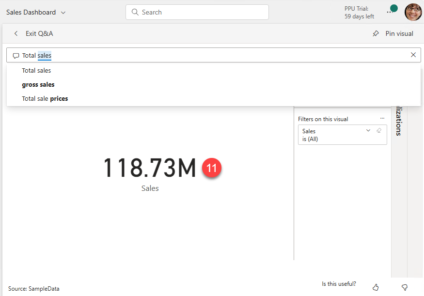
I’m going to add a little more and keep typing to add “Sales,” as shown in Figure 8. Now, the options are reduced to stocking stuffers, and there’s a Sales total at number 11.
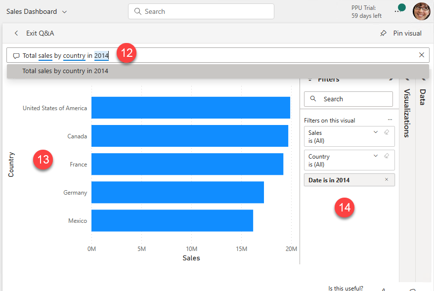
heck out the report canvas! It’s presenting the total sales. For what? Where did we sell it? When did we sell it? Let’s ask by adding to the question in Q&A.
As you can see in Figure 9, the more detail I add to my query (12), the more Power BI builds my chart into a graphic (13). It even applies the grouping and filters in the Filters pane (14)! Now THAT’S some holiday magic!
Forget drowning in spreadsheets; Power BI’s here to turn your data chaos into data on-demand. Oh, wait! There’s a bonus present under the tree! Power BI has a FREE desktop version, too. But that’s on the naughty list for another post.
Curious to learn more about Power BI? Join me on January 10, 2023 from 10:00am – 11:00am MTN for the “Getting Started with Power BI” session of our Kick Start 2024 emPOWER!Hour series. https://poweruplearning.com/2024-kickoff/
Stay tuned for the next tip in our 12 days of Christmas series. Until next time, I’m Shortcut Shari and it’s my job to make your job easier.

Shari Oswald
Shari is known as Shortcut Shari because she believes we should all work smarter, not harder, and she loves to share keyboard shortcuts. Shari has been using SharePoint since before it was called SharePoint and is excited to share her knowledge and expertise with those who are as excited about technology as she is. Shari's focus is the “People Side of Change.” As a Microsoft 365 Solutions Architect and Consultant that grew up right along with SharePoint, her practical knowledge of the Microsoft Productivity stack coupled with her passion for empowerment via learning makes Shari an excellent resource as a consultant and evangelist for Microsoft 365. Her philosophies for information architecture and SharePoint design are centered on solving business challenges with technology and ensuring usability and adoption for the organization. Shari is a Microsoft Certified Trainer, a Microsoft Certified Specialist Master, consultant, presenter, author, and evangelist. When she is not architecting SharePoint magic as a consultant, Shari is in the classroom or creating online learning for LinkedIn Learning, ClipTraining.com, and Pluralsight.