Components in Power Apps: An Overview

Components in Power Apps: An Overview
Power Apps, which is included in Power Platform, is a low-code platform that enables its users to construct business applications in a speedy and efficient manner.
Experience in making without using components
Most makers will start with building Power Apps canvas apps by dragging and dropping controls on the screen and then adjusting them to their needs. Although this leads to results, it is not the most efficient way to build apps, especially when they become more complex. Let’s dive into what this out-of-the box experience in Power Apps looks like and I’ll suggest which issues you may encounter and how to get a better result.
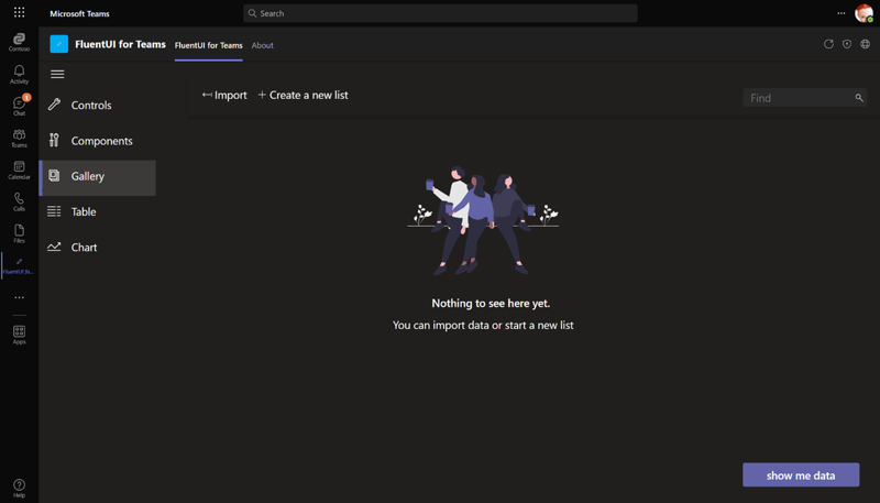
Simple controls
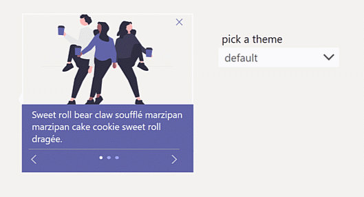
In most cases, app development is accomplished through the Power Apps portal, which can be accessed at make.powerapps.com. Makers will be able to find screen templates and fundamental user interface controls within this web interface including buttons, text labels, input fields and more. They can make simple modifications to these controls in terms of colors, sizes and shapes, at least to some degree. They can also save some time by copying an adjusted control to either the same screen or to a different screen to use. Nevertheless, if they update one control, it will not have any effect on the other controls.
As an example, a maker has the intention of building a button that has particular values for the FILL, HOVERFILL and PRESSEDFILL properties. After finishing these steps, they will need to repeat this process for each button within the app in order to achieve design consistency, which is a task that could be considered laborious.
If these values change later in the project, or if our maker uses that app as a starting point for the next app, but this time, the color scheme should be blue/purple rather than green/grey, then they will need to begin the project from the very beginning again. That is not necessarily a useful or beneficial experience.
Now, we could argue that makers should decide the look and feel of the user interface (UI) upfront and only start building their screens once this task is out of the way. This would be consistent with the previous point. But the reality, of course, looks quite a bit different because it's not always or primarily those very basic UI controls that cause additional effort, and because those apps are built very quickly.
More sophisticated user interface experiences
The majority of app makers quickly come to the conclusion that the built-in controls of Power Apps have some limitations, despite the fact that Power Apps are an excellent way to get a quick start in the app creation process. To name a few examples only:
- In DisplayMode View, button outlines are not allowed to be displayed.
- The datepicker/calendar control has way too little room for customization.
- Input fields are not allowed to have a bottom outline.
To remedy this, the creators could, for example, assist themselves with the input field by positioning a rectangle with an extremely short height directly below the input field and then grouping the two of them together. It is a workaround to a problem that they should not have in the first place. Also, this “solution” will require them to always adhere to that, which will make the situation increasingly complicated.
Even bigger elements
What if we expand our thinking even further? What are some essential app features that should be included in each app? How about the navigation bar, the header, the footer, dialog boxes and the settings area. What if we constructed these components in advance so that we would never have to build them again? Naturally, this would make the development process go much more quickly and would boost overall productivity. However, in the absence of components, we compel all makers to fail.
Is there no other option?
Wouldn't it be fantastic if (advanced) makers could make their own controls and save them, ensuring that every instance of this user interface element used in an app would be brought up to date whenever the component itself was updated?
In this example, we would modify an existing component by including an input field and a rectangle, and we would set the FILL property of the rectangle to be dynamic. Whenever we use this component now in our app, it looks exactly the same – and if we later on change our mind – or if there is a new requirement (for example: change the color of that rectangle to red in case there is an error), we only need to update the component once, and all of the instances will be updated immediately afterward.
This complies with one of the rules of developing software that is most frequently cited: It works according to the DRY principle. Don't repeat yourself is the acronym for a programming principle known as DRY, which states that a piece of code should only be written once even if it will be used multiple times. Using the code-first development methodology, we would begin by constructing a function, and we would use it in subsequent stages when appropriate. The same principle applies to canvas components: We must develop them once, and then we can use them in any situation.
We need a centralized repository for custom UI elements because not only do we want to achieve design consistency within a single app, but we also want to achieve design consistency across all of an organization's apps.
Power Apps component libraries
Component libraries for Power Apps are assemblages of pre-built and re-usable components that can be incorporated into the development of Power Apps. Canvas components are an important part, and users of Power Apps have the ability to make use of them. Libraries are able to provide access to a wide variety of components, such as user interface controllers as simple as buttons and text boxes, as well as more complex components such as calendars, maps and charts.
When using canvas components sourced from high-quality libraries, makers are able to construct applications of a high quality in a quick and efficient manner. Due to the fact that the components have been pre-built and tested, the likelihood of them containing bugs has been significantly reduced, and it is ensured that they will perform as expected. This not only saves time, but it also reduces the overall costs that are associated with the development and maintenance of Power Apps applications. With the help of components, makers are able to construct one-of-a-kind controls, forms and other elements that can be utilized in multiple apps. As a direct consequence of this, a significant reduction in the amount of time and effort required to construct and maintain applications has been achieved.
Where can I get my hands on these component library collections?
There are many different ways in which you can give your makers more power by providing them with experiences that are already built, design-consistent, accessible, tested and documented. Here are three things to consider:
1. You give the advanced makers and developers in your organization the responsibility of constructing a component library on their own so that they do not have to keep inventing the wheel over and over again. You can expect:
- A steep curve in terms of learning.
- The quality may differ depending on the level of skills used.
- Components that are in line with the design of your company.
2. You find someone else to carry out the exact same function described in 1. Advantages:
- You do not have to make use of the resources available within your organization.
- An excellent final product
- Components that are in line with the design of your company.
3. You make use of the component libraries and individual components that are made available by the community. Trade-offs:
- There is a possibility that components from different sources will not align.
- The quality might be different depending on the source.
- Lack of consistency with the overall design of your company
Improving the experience of being a maker
When it comes to the overall productivity of makers and the user experience (UX) that can be achieved with Power Apps, the canvas components are extremely important. They make it possible for makers to create bespoke UI elements that are especially crafted to fulfill the requirements of the business as well as the requirements of the users. These bespoke UI elements can then be used by the business to fulfill the requirements of the users.
For instance, we can use canvas components to construct forms that are tailored to specific kinds of data, such as address information, product information or customer information. Similarly, we can also use these components to build forms that are responsive to mobile devices. These forms can be made responsive, customized to have a particular look and feel or optimized to work with particular kinds of data. Because of this, it is now much easier for users to enter data into the application, which in turn reduces the likelihood of errors being made by users. This, in turn, leads to an improvement in the user experience.
Canvas components simplify the process of developing bespoke controls that are designed to work with specific types of data, such as dates, times or numbers. This is another advantage of using Canvas components. These controls can be customized to function with a variety of different data types. Because of this, users will have a much easier time working with the data, which will lead to a reduction in the likelihood of errors as well as an increase in overall productivity.
Possible consequences for the management of Power Platforms
The administration of the Power Platform is significantly impacted in a variety of ways as a direct result of the utilization of canvas components within Power Apps. We will want to ensure that the quality of these canvas components is high so that then every maker will use them, and we will take care of maintaining, documenting and distributing them in the appropriate manner. This is because canvas components are highly modifiable and can be used to create business apps quickly.
For instance, companies should establish standards for the design and functionality of canvas components to ensure that these components behave in the same manner across a variety of applications. These standards should be implemented to ensure that businesses can compete effectively. This not only makes the overall experience more enjoyable for the user, but it also makes it simpler in the long run to maintain and update the many different components.
In addition, organizations need to develop guidelines for the management and control of canvas components in order to ensure the genuineness of the components and their level of safety. In order to accomplish this, it is necessary to make use of version control and configuration management, in addition to testing and validating each individual component before it is put into production.
PCF components and canvas components
Components such as those found in the Power Platform component framework (PCF) and the Canvas framework are two examples of the types of components that can be used in Power Apps. Even though they are both able to be used in Power Apps, the two different kinds of components serve different functions and have different sets of capabilities.
Canvas components provide a graphical user interface that can be used to construct and personalize UI snippets. They are easy to work with and are ideally suited for the construction of straightforward, user-customizable components that are utilized in canvas apps.
On the other hand, PCF components provide a platform that is both more powerful and versatile, and they can be used to design more scenarios that can’t be achieved by canvas components. For example, it is not possible to create an iFrame component as a canvas component. An iFrame is a HTML element that loads another HTML page within the document. There is no way this can be achieved with canvas controls, but we can create it as a PCF component using TypeScript.

Conclusion
Canvas components are an essential part of the Power Apps platform, and the customers who invest in Power Platform will benefit from the important role that they play in their daily lives. By providing makers with access to high-quality component libraries, we are able to reduce the amount of time spent on repeatedly finding a solution to the same problem, thereby improving both the satisfaction of makers and the user experience. Rather than being considered a cost factor, the work that goes into developing components and the libraries that support them should be viewed as an investment. In an ideal scenario, makers are given components that have been professionally developed and instructed on how to modify these components to meet their requirements. They can gain the knowledge necessary to make their own components of a high standard, thereby enabling even more makers.
This is the first installment of the comprehensive guide to the components of Power Apps. Learn "How to get started with Power Apps components and Power Apps component libraries" by reading the following section of this article.
Resources

Luise Freese
Luise Freese is an independent Microsoft 365 & Power Platform consultant, building solutions with a combined approach of both worlds low-code and code. She is an awarded Microsoft MVP in two categories (M365 Development and Business Applications), international conference speaker, open-source maintainer, and blogger. She loves all things community, stickers, and the number 42.
Twitter: https://twitter.com/LuiseFreese LinkedIn: https://linkedin.com/in/LuiseFreese Blog: https://m365princess.com