Zero to Hero: A Beginner's Guide to Power BI

Before a business can make the right decisions, it must have the right information. Microsoft Power BI is a business intelligence tool that helps users access and analyze that information. It allows anyone — from the non-coding business analyst to the seasoned developer — to visualize and analyze large amounts of data in an interactive and intuitive way. Power BI unlocks the door to data insights, and it’s very simple to get started. In this guide, I will walk you through the basics of Power BI and show you, step-by-step, how to create a simple, interactive dashboard so you can go from zero to hero in translating data into powerful business insights.
What is Power BI?
It’s important to distinguish between Power BI offerings as you consider building reporting and analytics capabilities for your organization. These include:
- Power BI Desktop
- Power BI Service (Pro & Premium)
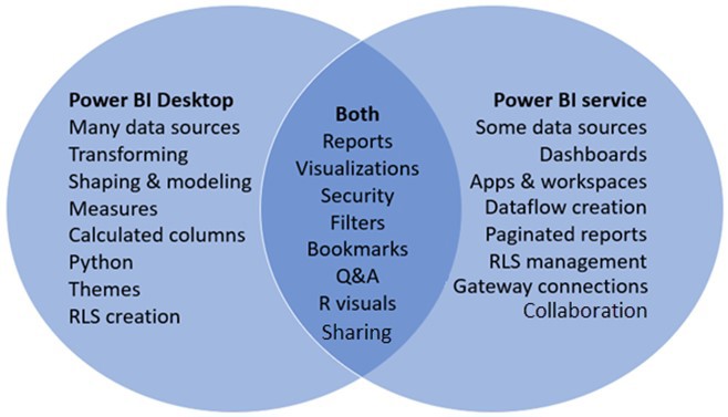
Power BI Desktop is a robust desktop application used for data modeling and creating reports and visualizations. Power BI Service is the cloud-based version used to share and collaborate on reports and visualizations. The two offerings overlap in many ways but have distinct differences. For example, Power BI Desktop allows you to build and publish a dashboard, but Power BI Service licenses allow you to share that dashboard with others. The Venn diagram below highlights a few other differences in features.
Connecting to data
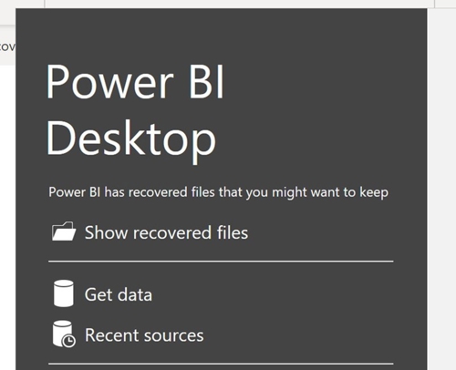
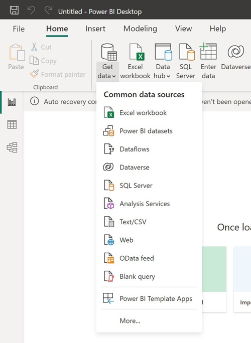
Once you have the Power BI tools and access you need, you can begin connecting to your data. Power BI Desktop allows you to connect to a wide variety of data sources, including Excel, CSV, SQL Server, SharePoint and the web, among others. There are a couple of ways to get started:
1. Select Get Data in the pop-up window when you first open Power BI Desktop. From here you can select from a range of potential data sources.
2. You may also want to connect to data from your report workbook. Within the Home ribbon, you can select Get Data at any time.
Following the prompts, you will then be given the option to load your data as-is or transform your data within Power BI. As a general rule, I always select Transform to prepare and review the data before building out my report.
Transforming data
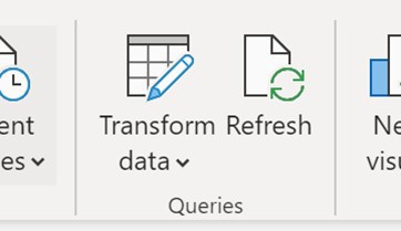
To transform your data, Power BI leverages a built-in data modeling tool called the Power Query Editor. This editor window tracks all the changes you make to your data set and makes it easy to recreate or revise those changes. Within the editor window, you can filter, sort, aggregate, and modify columns, create calculated measures, change data types and more. The Power Query Editor window can be opened at any time by selecting Transform Data on the top ribbon.
Selecting this option will open up a separate window. There are a few things you should always review when preparing your data in the Power Query Editor:
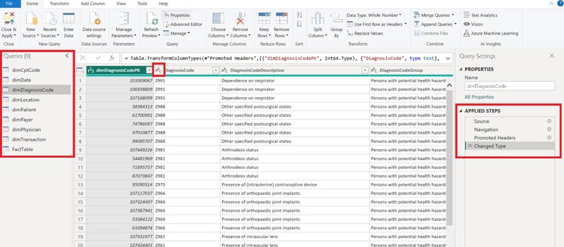
- The Queries panel (red box on the left-hand side) shows you all of the tables in your dataset. Ask yourself if everything you need is there and use this panel to navigate between tables.
- Data types for each of your columns (middle red box). Click on the data type symbol to make changes. The data type has a dramatic impact on visualizations and calculations within your reports.
- Applied Steps (red box on the right-hand side) tracks all the changes you make to the dataset. This helps you recall what you did, revert changes made and re-apply the same transformation steps at a future date. Simply click on a previous step to undo or revert changes in your dataset.
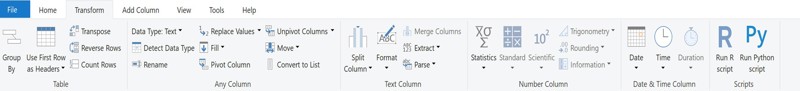
- And of course, review your data values! The Transform ribbon gives you an intuitive way to modify your dataset for visualization and analysis. Power Query Editor allows you to split columns, modify values, format strings and more.
When all transformation and data cleanup is complete, select Close and Apply in the home ribbon and the Power Query Editor window will close.
Creating table relationships
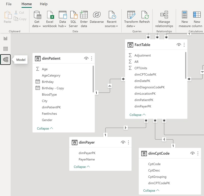
Depending on your dataset, you may also need to define relationships between different tables in your data. Table relationships are the links between different tables in your data model that allow you to combine data from different sources in your report. By using the Model feature in PowerBI, you can make these changes quickly.
Power BI automatically attempts to establish table relationships in your dataset, but the default data model can be modified within this view by selecting the option window for a given table, clicking Manage Relationships, and editing existing or creating new relationships.
Building a report
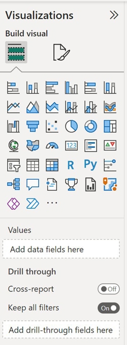
With your data cleaned, transformed and relationships established, you can finally start building a dashboard! Power BI has a drag-and-drop report builder that makes it easy to create visualizations and reports. You can use a variety of charts, graphs, maps, filters or slicers to allow users to interact with and understand the data.
Simply click on one of the Visualizations tiles and it will pop up on your page. To populate with fields from your dataset, drag them from the Data panel into the Values box underneath the visualization tiles.
Keep your visualizations simple and purposeful. Extraneous information and complicated visualizations can make it difficult for the end user to decipher the analytical insights they’re looking for.
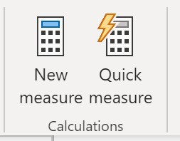
Many reports also require use of calculated fields. These can be added within Power BI by selecting New Measure or Quick Measure in the Home tab. Custom calculated measures use DAX (Data Analysis Expressions) which are also used in other Microsoft tools. I won’t cover those in depth here, but Microsoft has great documentation that I still reference regularly and recommend to anyone using Power BI: https://learn.microsoft.com/en-us/dax/.
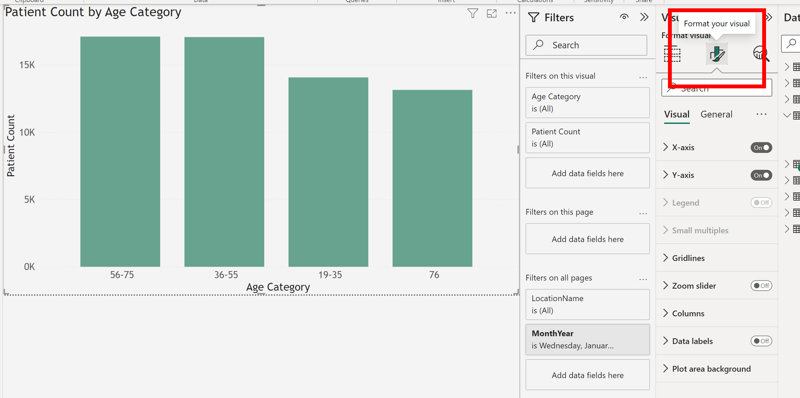
Once you have landed on the right visualizations, you can edit formatting by toggling to the formatting options of each visualization. From here you can adjust labels, colors, legends, axes, fonts, etc. and can make your dashboard cohesive and intentional.
Publishing dashboards
Your report is now ready to share. To publish it as a dashboard, you’ll need to have a Power BI Pro or a Premium account. Once you have that set up, click on Publish in the Home tab. This allows you to share access to the report or embed it in a website or application for others to use. Now you and others can admire your handiwork and gain the data insights you all need!
Conclusion
Power BI is a powerful tool that can transform your organization’s raw data into usable insights. This guide has introduced you to the basics of Power BI and how to build your first report. Note that these steps are just the beginning of all you can do with the tool. To learn more, keep experimenting and check out our other Power BI articles.

Audrey Workman
Audrey Workman is an experienced analytics professional with a deep love for data, design, storytelling, collaboration, and solving complex problems in healthcare. She is an expert in data visualization and translating data into actionable insights to improve business performance. She graduated from Brigham Young University with a degree in microbiology and University of Minnesota with a master's degree in healthcare administration.