Seven Data Transformations in Power BI

In this article, I'll discuss seven types of data transformations that everyone should learn to do in Power BI Power Query Editor. These transformations will help you clean and shape your data quickly and effectively so that you can get the most out of your report.
1. Split Columns: Splitting columns is a common data transformation that allows you to separate the values in a column into multiple columns. This is useful when you have data that is combined into a single column, such as a full name or address. To split a column in Power BI, select the column you want to split, then click Split Column in the Transform tab. In the example shown in Figure 1, split column would allow you to create separate columns for first and last name.
2. Merge Columns: Merging columns is the opposite of splitting columns. It allows you to combine the values from multiple columns into a single column. This is useful when you have data that is spread across multiple columns and you want to combine it into a single column for analysis. To merge columns in Power BI, select the columns you want to merge, then click Merge Columns in the Transform tab. It will then give you the option to select a delimiter.
3. Pivot Data: Pivoting data allows you to rotate your data so that the rows become columns and vice versa. This is useful when you have data that is organized in a way that makes it difficult to analyze or visualize. Think of it like using a pivot table in Excel. Rather than painstakingly restructuring your data model, a quick click can give you the data structure needed for analysis. Select the column you want to pivot, then click Pivot Column in the Transform tab.
4. Unpivot Data: Unpivoting data is the opposite of pivoting data. This function flattens your data by ensuring that all values for a given measure are in the same column. To unpivot data in Power BI, select the columns you want to unpivot, then click Unpivot Columns in the Transform tab.
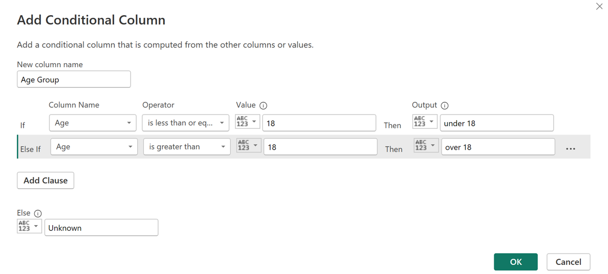
5. Conditional Columns: Conditional columns are one of my most used data transformations. I find a lot of value in using them to create categories for my data visualizations. Conditional columns allow you to label records based on criteria from one or more columns. To edit the conditions for these fields in Power BI, select Conditional Column in the Add Columns tab. It will then open a window where you can enter IF statements (Figure 2).

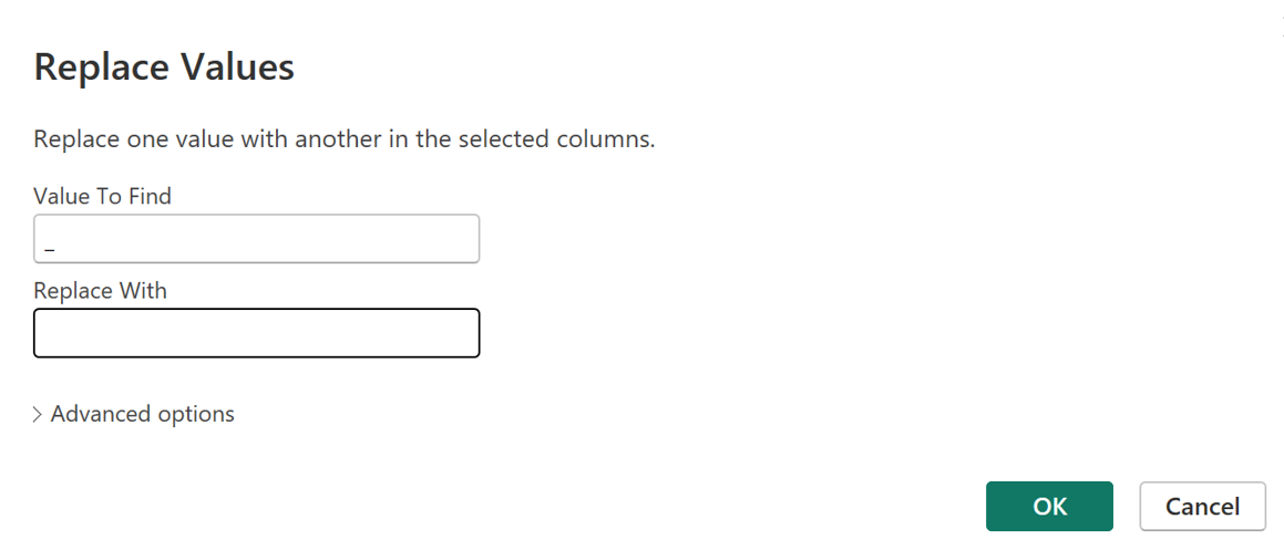
6. Replace Values: For a polished dashboard or visualization, you must have clean values within each of your fields. The Replace Values function helps you clean up any unwanted characters (Figure 3). I often use this option within the Transform tab to remove apostrophes and extra spaces from my string columns. Power Query allows you to apply these clean-up steps very quickly so no manual edits are needed.

7. Calculated Columns: Calculated columns allow you to create new columns based on calculations or formulas applied to existing columns. This is useful when you want to create new metrics or KPIs based on your existing data. To create a calculated column in Power BI, right-click on an empty space in the Fields pane and select New Column. Then enter your calculation or formula using DAX (Data Analysis Expressions) language. Note that this can be done in Power Query editor or created later in the Power BI report view.
Each of these data transformation steps help me streamline report development and data clean-up. By mastering these transformations, you'll be able to lower risk from manual clean-up, efficiently prepare data for analysis and visualization, and track applied changes along the way.

Audrey Workman
Audrey Workman is an experienced analytics professional with a deep love for data, design, storytelling, collaboration, and solving complex problems in healthcare. She is an expert in data visualization and translating data into actionable insights to improve business performance. She graduated from Brigham Young University with a degree in microbiology and University of Minnesota with a master's degree in healthcare administration.