Quick Tricks to Make Your Power BI Model Smaller, More Efficient and Definitely Faster

Power BI has been a leading data visualization tool in the market for years. It can be used as a self-service data analysis tool, or as an enterprise-governed business intelligence tool. According to the official website:
“Do more with less using an end-to-end BI platform to create a single source of truth, uncover more powerful insights, and translate them into impact.”
Power BI is designed to be user-friendly. With just a few clicks, you can import data from various sources, combine them together in one data model and start analyzing it using powerful data visualizations. This sometimes leads to a scenario where people are just importing data into the tool without giving it too much thought. When you’re working on a solo project on a small dataset, there probably won’t be too many issues. But what if your report is successful and you want to share it with your colleagues and maybe other departments? Or more data is loaded into the model, but refreshes are taking more and more time? Even other data sources are added into your model, but writing DAX formulas has become hard, and reports are slowing down.
In this article, we’ll cover a couple of tricks that will help you make your Power BI models smaller, faster and easier to maintain. In the immortal words of Daft Punk: “Harder. Better. Faster. Stronger”.
Trick #1: Model your data using star schemas
In the data warehouse and business intelligence world, star schemas have been around for decades. The principle is straight forward; you have two types of tables: facts and dimensions. A fact table models one of the business processes (such as sales, returns, temperature measurements etc.), while a dimension contains descriptive information about a certain business object (customer, employee, geography etc.). A fact table contains one or more measures (numeric information), while dimensions contain mostly textual data. The modelling technique is called a star schema because if you draw a diagram with the fact table in the middle and the dimensions around it, you get a star shape:

Explaining the whole theory of star schemas – also often called dimensional modelling – would take us too far for one single article. If you want to learn more, you can check out the book, The Data Warehouse Toolkit: The Definitive Guide to Dimensional Modeling.
But why exactly is a star schema better for Power BI? First of all, star schemas are very intuitive to work with. Imagine it like this: everything that you want to filter on, slice upon, or want to put on the axis of a chart, comes from a dimension. Everything that you want actually visualized (numbers in a table, lines or bars in a chart) comes from a fact table. Let’s illustrate with a matrix visual:

Power BI is optimized to work with a star schema. When you have a filter or a slicer on a dimension column, it doesn’t have to load many values, since dimensions are typically small. If you have everything in one giant table, your filters will need to scan this whole table just to get a list of the possible values. Filtering from small tables to larger tables (the fact tables) is very efficient in Power BI.
Another downside of not modelling with a star schema is that formulas written in DAX (the modelling language of a Power BI model) get more complicated. When all the data is in one big table, it’s possible to get some calculations incorrect. For example, calculating the average age of a customer isn’t as straight forward as it seems, since the same customer might be repeated multiple times in the table. Or, if you imported some tables from a relational database, it’s possible they were “normalized”, which is a design method used to make databases fast for writes (inserts, updates and deletes). But normalized tables are harder to read from since you need to join many of them together to get the desired data. And again, they make DAX formulas harder to write. The article, The Importance of a Good Data Model in Power BI Desktop, has a couple of good examples on how star schemas make your DAX formulas easier. The book, Analyzing Data with Power BI and Power Pivot for Excel, also dives deeper into this topic and is really recommended if you want to improve your Power BI skills. If you’re short on time, you might like the YouTube video from Guy in a Cube’s Patrick: Why Power BI loves a Star Schema.
Okay, designing your Power BI model as one or more star schemas isn’t exactly a “quick trick,” but if you take it up from the start it will definitely save you time in the long run.
Trick #2: Disable auto date tables
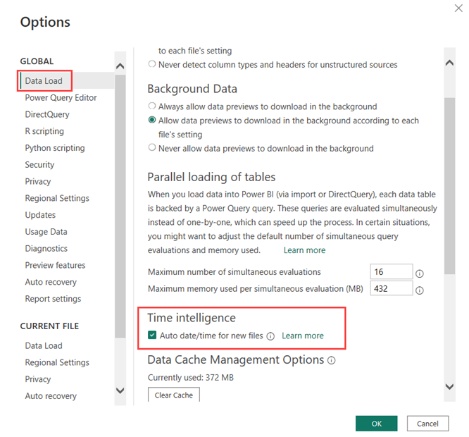
Even if you diligently create your Power BI model with perfectly crafted star schemas, there are still many ways to optimize the model. One of the easier tricks involves the auto date/time tables. This is a setting in Power BI Desktop (Figure 4) that tells the model to automatically create a data table for each datetime column of your model.
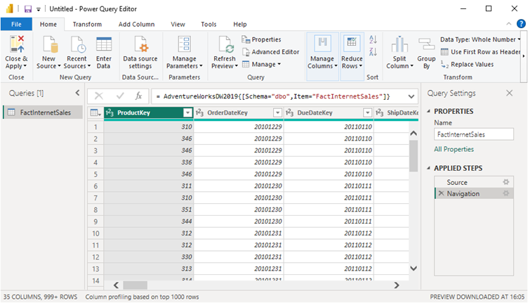
By default, this setting is enabled. But what does this time intelligence feature actually do? Let’s import a single table into a Power BI model. I’m using the Adventure Works sample data warehouse for SQL Server. You can download and use these sample databases for free. Using Power Query, I ingest one single table – FactInternetSales – from the AdventureWorksDW2019 database without applying any transformation.
When the data is loaded into the model, we can directly analyze it. Let’s create a line chart with Sales Amount on the y-axis and OrderDate on the x-axis.

Instead of individual dates on the y-axis, we get aggregated data on the year level. How is this possible? This is the auto date/time feature kicking in. For every datetime column, a date table is created behind the scenes. This date table contains extra columns, such as year, quarter and month. You can see this in the field list when you expand a datetime column:
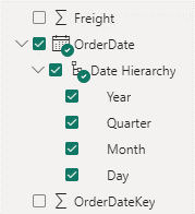
A neat little hierarchy (year -> quarter -> month -> day) was created for you. This enables unexperienced users to get started with analyzing/visualizing data in Power BI right away, without any serious modelling effort. In the visual, you can see the effect of the hierarchy when you drill down to lower levels, such as the month level for example:

This is a great feature if you have a small model and not that many datetime columns, but for larger models incorporating many tables this can have a profound impact. Power BI Desktop scans the datetime column, finds the minimum and the maximum values and creates a date table encompassing the entire range. If you have a lot of datetime columns, this is a silent killer. Ideally you have one single date dimension that you maintain yourself. When there are 20 datetime columns, you suddenly have 20 invisible date dimensions!
Let’s open up the hood of our Power BI model and see what those tables look like. This can be done with a tool called DAX Studio, which you can download for free. With your Power BI Desktop model still open, start DAX Studio and select your model from the dropdown list:

DAX Studio will connect to your model and display some metadata in the object browser on the left. There we can find our hidden date/time tables:
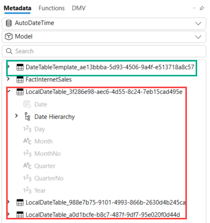
There are three datetime columns in our table, so we have three hidden local date tables. There’s even a 4th table, which is the template for this date table. Let’s get rid of these tables, which can simply be done by deselecting the feature from the options menu (keep in mind there’s an option for the current file, and a general option for all new files).
For our small model with a single table, only three datetime columns and a date range of merely four years, the impact isn’t that big (about 4% of the total file size). But for very large models this can have a profound impact. I’ve seen models lose tens or even hundreds of megabytes in size by disabling this feature. Alberto Ferrari from SQLBI explains why disabling this feature is so important in the YouTube video, Automatic date time in Power BI.
Trick #3: Cardinality, cardinality, cardinality
The power of the Power BI model (pun intended) is that it can compress data really well, which allows you to load millions and even billions of rows into a model. However, not all data compresses equally well. When data of a column is compressed, Power BI creates a dictionary for that column. When this column contains a lot of unique values, compression will suffer. This leads to a bigger model, and it will consume more memory. By optimizing the compression for the biggest columns, it’s possible to make the model much smaller, which will make it consume less memory and thus be faster.
The number of distinct values in a column is called the cardinality. The higher the cardinality of a column, the more space that column will consume. There are a couple of best practices that allow you to reduce the cardinality of a column:
- When you have a column containing decimals, consider reducing the number of decimals after the decimal point. For example, if you have a column with percentages values (everything between 0 and 1) and there are five digits after the decimal point, you have 100.001 unique possible values (everything from 0.00001 till 0.99999 + the numbers 0 and 1). When there are only two digits behind the decimal point, there are only 101 unique values. This doesn’t seem like much, but what if you have a regular decimal number, something like 1748.845687 vs 1478.85? Then the difference in compression will be huge, since the number of unique values is much higher. Unless you need really precise measurements, two or three digits usually suffice.
- The same goes for datetime columns. If you have a date that also includes the time portion, there are many unique values. If the precision goes up to the seconds level, there are 31,536,000 unique values in a single year. If you only keep the date itself, there are only 365 (or possibly 366) unique values in a year. Truncating dates to the day level will again yield high compression benefits. If you do need the time portion, it’s a good idea to put it into a separate column. A single date value of “2023-02-25 15:47:31” will become “2023-02-25” and “15:47:31”. Time itself has only 86,400 unique values as that’s the number of seconds in a day.
- Since Power BI only allows you to create single-column relationships, it might be tempting to concatenate several columns together in your table to create a unique key. However, this will lead to a column with a very high cardinality (equal to the number of rows in the table) and compression will be terrible if the end result is a text string. A better option is to create a surrogate key in either the data warehouse, or perhaps in Power Query. Surrogate keys are meaningless integers, which will have a better compression ratio than large strings.
- Speaking of text strings, they don’t really compress that well either if cardinality is high. Unlike with dates and numbers, you cannot just cut pieces off to reduce the number of unique values. Since dimensions typically don’t have that many rows, the presence of text columns isn’t that big of a deal. But in a fact table with millions of rows, text columns can have a big impact. You should either try to put the text in a dimension or remove the column altogether.
To give you a good head start when you want to optimize an existing model, you can use the tool called the Vertipaq Analyzer (Vertipaq is the name of the columnar database technology that drives the Power BI model). You can download this tool for free from the SQLBI website. The Vertipaq Analyzer is an Excel file with some queries in it. It can load all the metadata of a Power BI model and store it inside a PowerPivot model. It will give you an overview of all the columns in your model (and much more) and how much storage they consume. This allows you to focus on the columns that matter most. Let’s take a look at the Power BI model we created in the previous section.
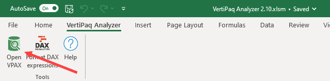
First, we need to export the metadata of our model using DAX Studio. In the Advanced ribbon, you can do this by using the Export Metrics feature.
This will create a .vpax file. Store it somewhere on your hard drive. In the Vertipaq Analyzer, go to the Vertipaq Analyzer ribbon, and choose Open VPAX. Load the file you just saved.
The data will refresh automatically. For our use case, the most important data is in the Columns tab. There we get a nice overview of how much space each column exactly consumes.

There are several interesting columns, such as the number of rows in a column, the cardinality and the dictionary size. As discussed earlier, the total size can be reduced by lowering the cardinality. This has an impact on the dictionary size. As you can see in Figure 13, almost half of the model is one single column! The SalesOrderNumber has the highest cardinality and by far the largest dictionary size. If this column isn’t really needed for your data visualizations, you can omit it from the model and thus slice the model size in half.
Another interesting observation is that each data column is included twice in the table: once as an actual date, and once as an integer (the column name ends with Key). Even though the data size itself is identical (96kb, all numbers presented are in bytes), the dictionary size for a date column is twice that of an integer column.
When you’re dealing with a large model, a tool like the Vertipaq Analyzer is crucial when you want to optimize the model. It clearly shows you on which columns you can focus to get the biggest gains.
Conclusion
In this article we showed you a couple of design tricks you can use as a Power BI developer to get the most out of your models. To summarize:
- Always use star schema modelling as a starting point for your model design. It can save you many headaches later on.
- Disable the auto date/time feature to avoid hidden tables being created for every datetime column in your Power BI Desktop file.
- Reduce the cardinality of each column as much as you can. Remove columns you don’t need.

Koen Verbeeck
Koen Verbeeck is a seasoned business intelligence consultant working at AE in Belgium. He has over a decade of experience in the Microsoft Data Platform, both on-premises as in Azure. Koen has helped clients in different types of industries to get better and quicker insights in their data. He holds several certifications, among which the Azure Data Engineer cert. He’s a prolific writer, having published over 250 articles on different websites and hundreds of blog posts at sqlkover.com. He has spoken at various conferences, both local and international. For his efforts, Koen has been awarded with the Microsoft MVP data platform award for many years.